
- Resources
Innovative Thinking


Before a visitor scrolls, they should be able to say three things: what you sell, whether you sell it to someone like them, and what to do next. Good homepage design is mostly the discipline of getting those three into the first screen and moving everything else down. A rotating banner, a stock photograph of a handshake and the word Welcome answer none of the three.
That first screen is worth more than the rest of the page combined, and it is usually the part a business spends least time on. Below: what belongs in it, what should move down, how the fold behaves in 2026, and a twenty-minute test for your own site.
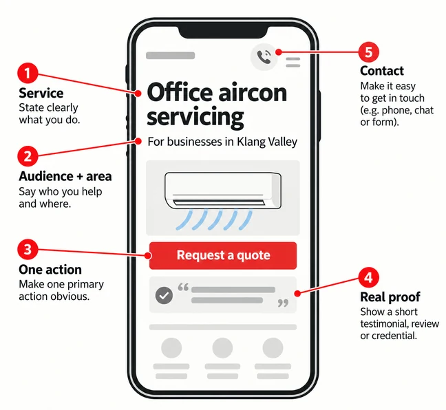
Five things, in roughly this order of importance. A homepage carrying all five in the opening screen is unusual; one carrying the first three is already ahead of most.
The first item is where most homepages fail, and they fail in one particular way: adjectives instead of a sentence. Three one-word virtues stacked over a night-time photograph tell a visitor nothing they could not have guessed. The Nielsen Norman Group makes the same point in its homepage design principles: say who you are and what you do, show real content rather than describing it, and keep the page simple enough that the eye can finish it.
Proof is the item most often dropped, usually because it feels like bragging. Visitors run a credibility check in the first few seconds, on ordinary operational details rather than design polish — the subject of our piece on the trust signals visitors notice before they contact you.
If a stranger cannot finish the sentence “this business does ___ for ___” from your first screen, nothing further down the page will be read carefully.
The fold is not a line the browser draws. It is a change in how hard people are willing to work, and it is sharper than “people scroll now” suggests. In eyetracking research published by the Nielsen Norman Group in 2018, users spent 57% of their viewing time on the first screenful, 17% on the second, and the remaining 26% spread thinly across everything below.
Two caveats. The same team measured 80% above the fold in 2010, so the trend runs towards more scrolling, not less; and an average across many sites is not a prediction about yours. What holds is the shape: a tall first screen, a much shorter second, then a long thin tail.
So there are two folds to design for, not one, and they are different heights. On a mid-range Android phone a sticky header plus a full-bleed hero can consume the whole visible area, leaving the headline below the fold on the device the visitor is holding. On a laptop the same page often shows too much at once and the eye has nowhere to land.
Which matters more depends on your own traffic, and that is worth checking rather than assuming. StatCounter recorded Malaysian web traffic at 64.13% desktop and 34.88% mobile for August 2026 — the reverse of what most people expect, and the reverse of what many consumer sites see in their own analytics. Open your numbers, take the two commonest screen sizes, and design the first screen for both.
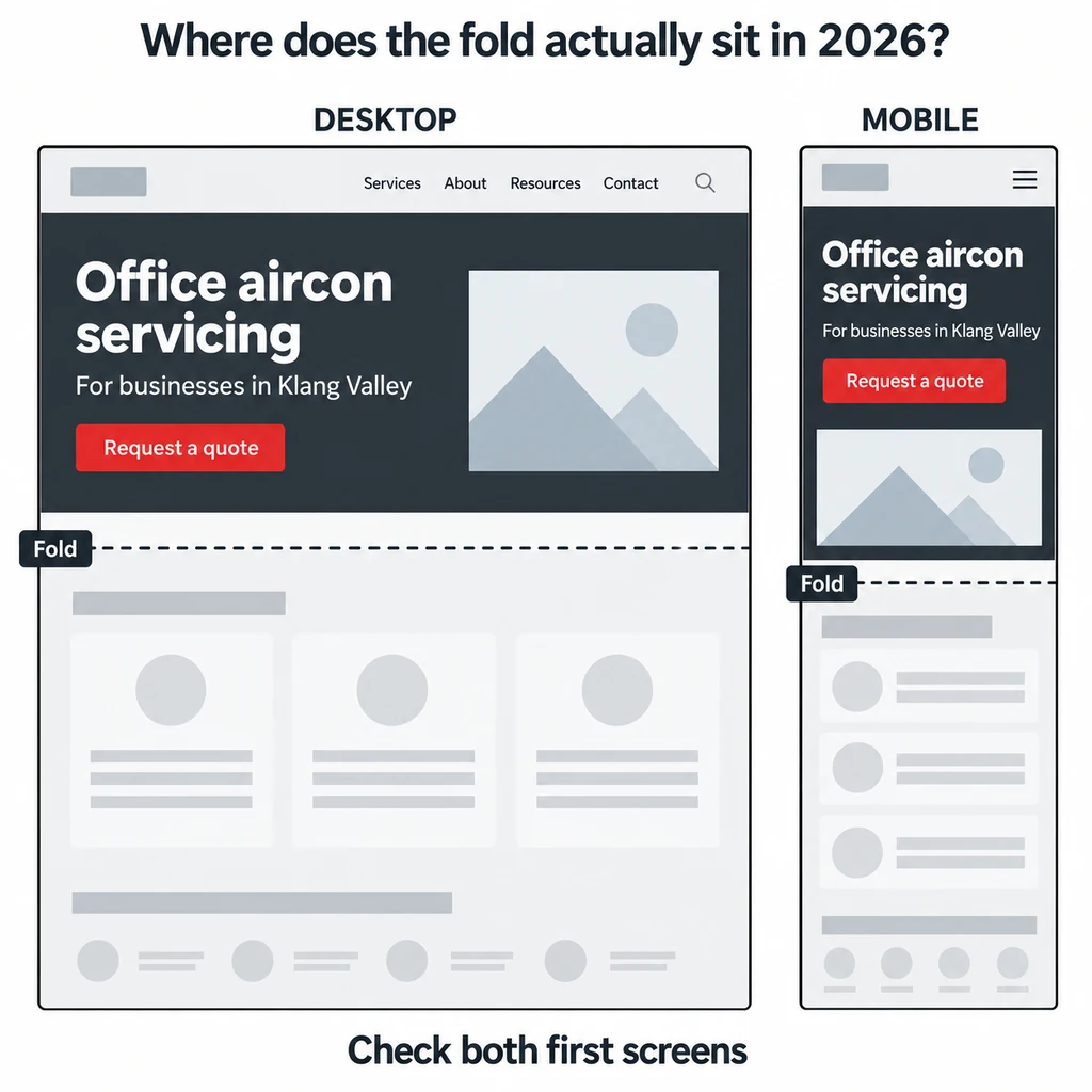
Most homepages do not lack content above the fold. They spend it on the wrong things.
None of these are new mistakes. They persist because they are what a page-builder template offers by default, and because deleting something from a homepage feels riskier than adding to it. It is the other way round.
After the first screen, the homepage answers the questions a real enquiry raises, in the order a customer raises them.
The enquiry path leaks most quietly, because it fails without any visible error: forms asking for a company registration number before a name, WhatsApp links that open a blank chat, contact pages with nobody behind them. We wrote about that pattern in why a website with visitors still generates no enquiries, and the fix is nearly always subtraction.
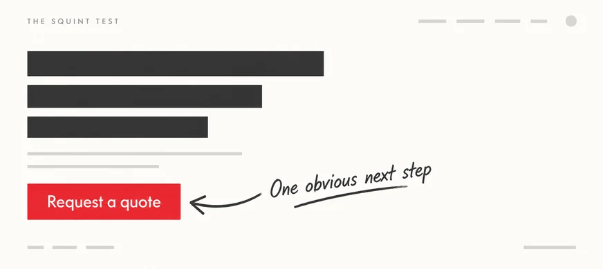
No tools, no budget, and you can do it this afternoon. Five checks:
Failing the five-second test and the squint test together usually means restructuring rather than restyling: new templates and new copy, not a new colour palette on the same layout. Failing only the 4G test is an image and hosting problem with a much smaller bill attached.
People scroll, but only after they have a reason to. The 2018 Nielsen Norman Group figures still put 57% of viewing time on the first screenful and 74% within the first two, so the fold is less a barrier than a filter. Give a visitor a reason in the first screen and they will happily read the fourth.
Long enough to answer the questions a genuine enquiry raises, and no longer. For most Malaysian SMEs that is four to six screenfuls: the opening screen, services, proof, the awkward questions and the enquiry path. Length is not the problem; unordered length is.
A range or a starting point usually earns more qualified enquiries than “contact us for a quote”, because the wrong visitors leave and the right ones self-select. If pricing is genuinely project-dependent, publish the drivers instead: what makes a project cost more, and what is excluded.
Most of the homepages we are asked to look at do not need replacing. They need the first screen rewritten, the carousel removed, the enquiry path shortened and the order of the sections changed to match how customers actually decide. Our website revamp and design service starts by testing the existing homepage the way described above and reporting what it finds, before anyone talks about a new design. If the five-second test is the one you are least confident about, start there.