
- Resources
Innovative Thinking


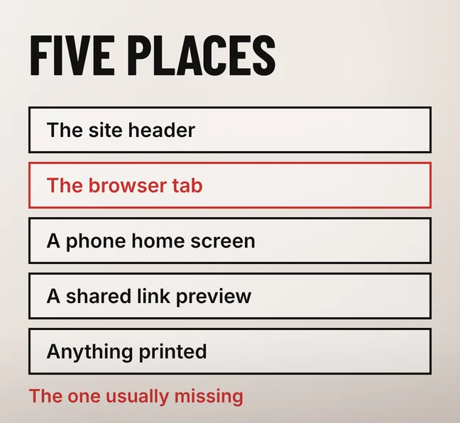
A website logo usually works in exactly one place: the header, on a desktop screen, where somebody approved it once. The same mark then has to be the icon in a browser tab, the square on a phone home screen, the picture on a shared link and the mark on a printed quotation, and that is where most of them come apart.
The repair is rarely a redesign. Most of the time three files are missing — a vector master, a transparent PNG and a square icon of the symbol on its own — and the designer who drew the logo may already have them sitting in the folder they sent you.
A website logo has to hold up in five places: the site header on a desktop and on a phone, the browser tab and bookmark list, the icon when someone saves your site to a phone home screen, the preview on a shared link, and anything printed. Most logos were only ever checked in the first one.
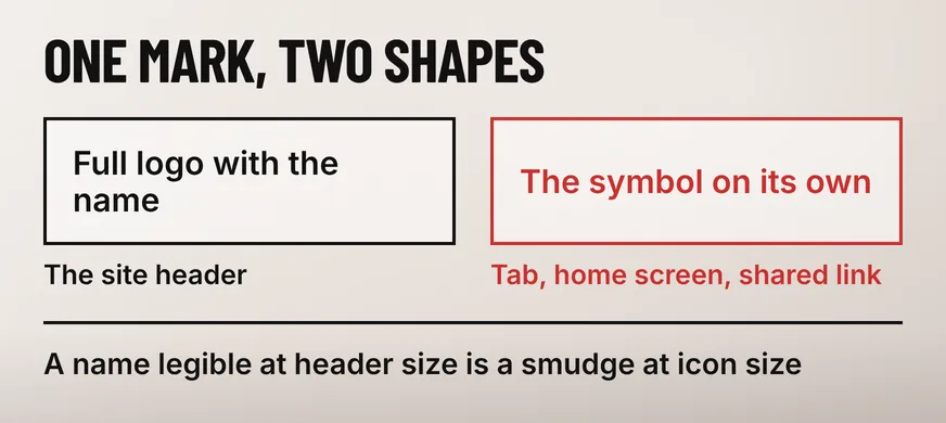
Those five are not one job. A header gives a logo a wide, short space with room for the business name beside the symbol. A browser tab gives it a square smaller than a fingernail, where that name turns into a grey smear. One file cannot be right for both, and asking it to be is what produces the blurry tab icon.
In Malaysia plenty of enquiries begin with somebody pasting your link into a WhatsApp chat, so the preview card there is worth a look of its own. It comes from the share image declared on the page rather than the header logo, and a page with no share image set gets a bare link with no picture.
Printed material is the surface owners do check, which is why so many sites end up serving a logo exported for print in a header that was never designed for it. What else belongs in that header is a separate decision, and we have written about what a homepage should show visitors first.
Use SVG for the header wherever your platform accepts it, and a transparent PNG everywhere SVG is refused. SVG stays sharp at every screen density, and a logo of flat shapes and a few colours usually ends up smaller as an SVG than as a PNG large enough for a high-density screen. The square icons stay PNG, because those have to be bitmaps.
MDN’s SVG documentation puts the reason plainly: compared with bitmap formats such as JPEG or PNG, “SVG-format vector images can be rendered at any size without loss of quality”. A header logo is drawn at a different size on practically every screen it meets, so the format that does not care about size belongs there.
Transparency is what goes wrong most often. A JPEG cannot store a transparent background at all, so a JPEG logo arrives with a white rectangle fused to it: invisible on a white header, obvious the moment that header takes a colour or sits over a photograph. Any logo still served as a .jpg is the first file to replace.
No single pixel size is correct here, and the guides that publish one contradict each other. The display width falls out of two things you can check yourself: how tall your header is, and whether your business name is still legible on a phone. The file behind it wants to be exported at roughly twice the width it displays at.
That doubling is about screen density. A mid-range Android phone paints two or three device pixels for every pixel the layout asks for, so a logo displayed 180 pixels wide is drawn with 360 or 540 real ones, and a PNG exported at exactly 180 looks soft. An SVG sidesteps the arithmetic, which is the strongest practical argument for using one.
Weight matters here too, because the header logo loads on every page and is charged against every page view. A print export dropped straight into a header is the usual offender, and the same arithmetic applies to the rest of your website images.
Because no favicon has been declared in the page and none sits at the root of the domain, so the browser falls back to its blank page icon. The same gap shows beside your result in Google Search, which draws that icon from the favicon your site declares rather than from your header logo.
Google’s own guidance on defining a favicon for search results sets out what the file has to be. It “must be a square (1:1 aspect ratio) that’s at least 8x8px”, and Google adds that “we recommend using a favicon that’s larger than 48x48px so that it looks good on various surfaces”. ICO, PNG and JPEG are all accepted, so an ordinary square PNG is enough.
The same page asks you to “make sure your favicon is visually representative of your website’s brand”, which rules out the default icon your theme shipped with, sitting beside your business in every search result and saved bookmark. At that size the full lockup reads as a smudge, so use the symbol on its own, cropped tight with the padding trimmed off.
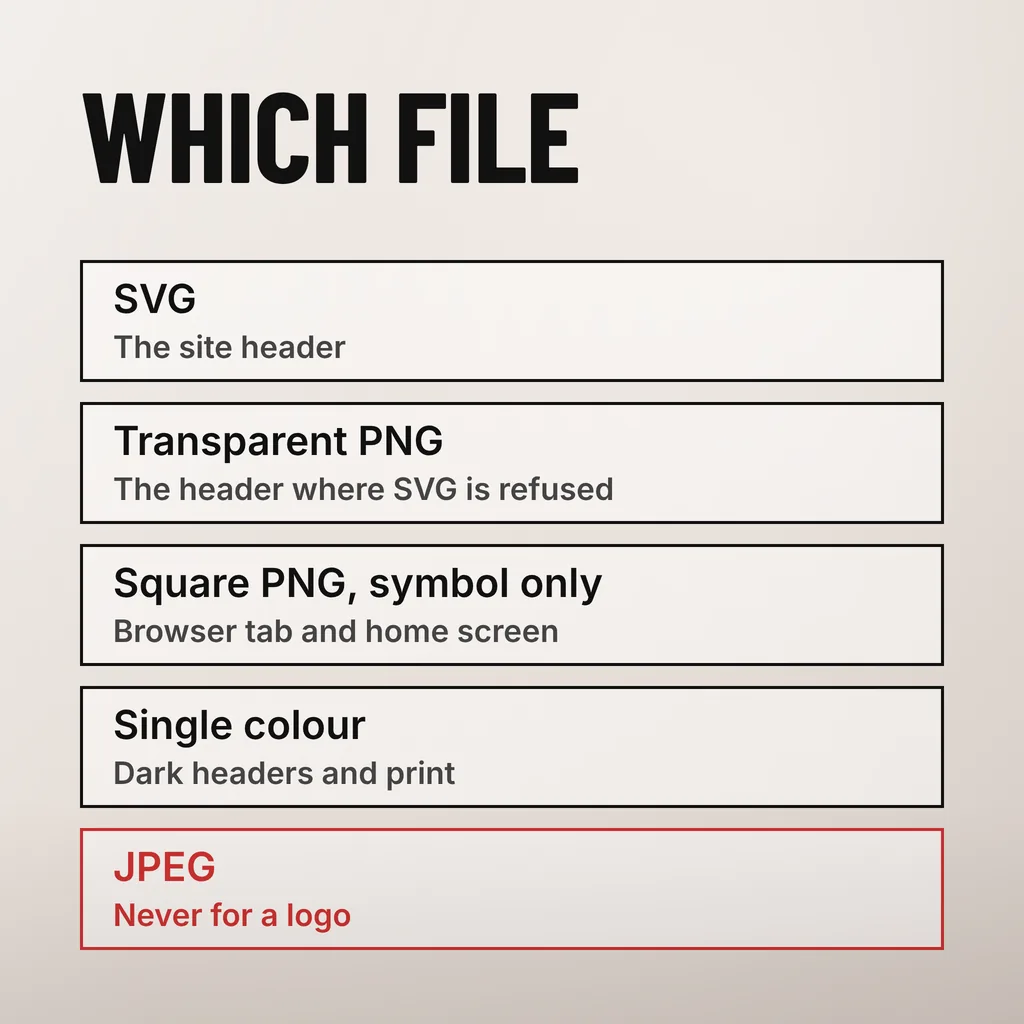
Ask for five: an editable vector master, an SVG of the horizontal logo, a transparent PNG of the same lockup, a square PNG of the symbol alone for icons, and a single-colour version for dark backgrounds and print. Those five cover every surface a website has, and any designer holding the vector master can export the set in minutes.
| File | Where it is used | What to check |
|---|---|---|
| Vector master (AI, EPS or SVG) | The source every other file is exported from | You hold it, and it is editable rather than a traced bitmap |
| SVG, horizontal lockup | The site header | Text converted to outlines, so it does not depend on a font being present |
| Transparent PNG, horizontal lockup | Headers where SVG is refused, email signatures | Exported at about twice its display width, background genuinely transparent |
| Square PNG, symbol only | Browser tab, phone home screen, social profiles | Still legible with the business name removed, padding trimmed off |
| Single-colour version | Dark headers, printed forms, stamps and invoices | Readable in one colour, with no shadow or gradient to lose |
The square files then have to be declared in the page before a browser will reliably use them. MDN’s reference for the HTML <link> element notes that “browsers automatically request /favicon.ico from the root of a site, and Apple also automatically requests /apple-touch-icon-[size].png, /apple-touch-icon.png, etc.”, and warns that declaring the icons explicitly is what “protects you against changes to these conventions”. On which sizes to supply, it says that “usually, it is sufficient to provide a large image, such as 192×192, and let the browser scale it down as needed”.
Ask for the set in writing, once, and store it somewhere other than an email thread. A developer handed nothing but a JPEG has to trace it or send you back to the designer, and that round trip is where this stalls for weeks.
Open your site on your own phone and walk the five surfaces in order. Look at the header, look at the browser tab, add the site to your home screen, send yourself the link on WhatsApp, and open the logo image file directly. Each check either shows your mark or names the file that is missing.
None of that needs a developer to diagnose, and the findings are usually the same three: a JPEG in the header, no favicon, no square version of the symbol. Putting the files in place, once they exist, is an hour of work.
Not directly, with one exception: the favicon. Google draws the small icon beside your result in search from the favicon your site declares, so a missing or generic one shows up in the results page itself. Everything else about the logo is a trust and recognition question rather than a ranking one, although a print-sized logo file loading on every page does slow the site, and speed is measured.
Yes. Visitors expect a header logo to be clickable and to take them home, and that expectation is old enough that breaking it quietly costs you navigation. Give the link honest alternative text as well — the business name, rather than the word logo — because that text is what a screen reader announces and what search engines read in place of the image.
Yes, and on most small business sites it is the right call. The usual arrangement serves the full lockup with the business name on desktop and the symbol on its own below a set screen width, so the header stays readable on a phone without shrinking the name into a grey line. It is a theme setting on most platforms rather than a development job.
We treat the logo as a set of files with jobs to do rather than one picture dropped into a header, and the audit above is the first thing we run on a site we are asked to revamp. Our creative and design service covers rebuilding that file set from whatever you still have, including tracing a mark back to vector when the original artwork is gone. One thing to do this week: open your own site on your phone and look at the browser tab.