
- Resources
Innovative Thinking


Usually, yes, and rarely because of the typeface itself. Website font readability comes down to five things you can check on your own phone in about ten minutes: whether body text is big enough, how long each line runs, how much space sits between lines, whether the text is dark enough against its background, and whether the font arrives quickly enough to be seen at all. Each one is a stylesheet change, not a rebuild.
Malaysian sites have a sixth: a page that switches to Chinese often switches to a font nobody chose. Each check below comes with the number the W3C or browser documentation sets, so the talk with your designer is about measurements, not taste.
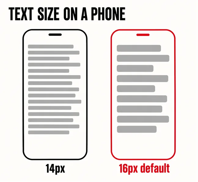
Start from the browser’s own default, which MDN’s CSS reference gives as “usually 16px”. A site that sets body text at 13 or 14px has shrunk it on purpose, usually because it looked tidier on a large monitor. On a mid-range phone held at arm’s length on the LRT, that is the difference between reading a paragraph and skipping it.
Then check what happens when a reader makes it bigger. WCAG 2.2 success criterion 1.4.4 asks that text “can be resized without assistive technology up to 200 percent without loss of content or functionality”, and the W3C names the usual failure: words “too wide to fit into the horizontal space available to them, causing them to be truncated”. Raise the browser’s text size to its largest (Text scaling in Chrome’s accessibility settings on Android, the aA menu in Safari), reload, and look at the menu, the buttons and any text in a box of fixed height.
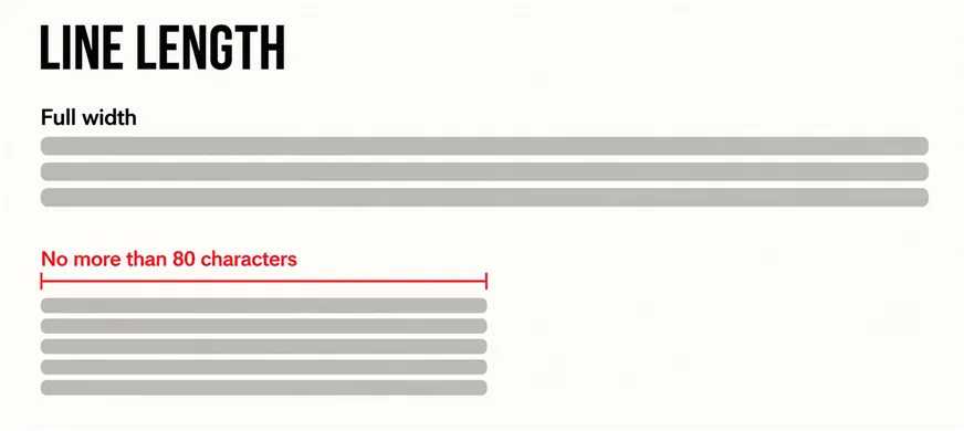
Shorter than most desktop pages make it. The W3C’s stricter AAA criterion, 1.4.8, asks that a block of text be “no more than 80 characters or glyphs (40 if CJK)” wide, because “long lines of text can become a significant barrier” for people with some reading or vision disabilities. Phones rarely break that ceiling. Desktop pages with full-width text break it constantly, and the eye loses its place on the way back to the next line.
The fix is a maximum width on text containers, set in ch or em so it scales with the font. Comfortable text is much of what makes a site easy to use on a phone rather than merely mobile-friendly, and what lets the five-second homepage test pass for the right reasons.
More than most themes give it. The clearest numbers are in WCAG 2.2’s text spacing criterion, 1.4.12, which lists four values a page must cope with when a reader sets them:
The criterion does not require your design to use those values. It requires that “changing these four style properties to the specified values should not result in a loss of content or functionality”, because some readers override spacing in order to read at all. A body line height of 1.5 is comfortable in its own right, and a layout built to hold it rarely breaks.
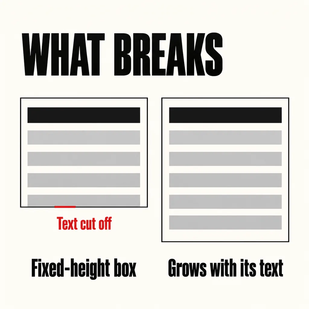
What breaks is text inside a fixed-height box: a card, a button, a caption over a banner. Add spacing and the text spills out or is cut off. A box that grows with its text never has this problem. Chinese, which puts no spaces between words, is exempt from the word-spacing value, but line height matters just as much.
Yes, and it is the readability fault we meet most often on sites that otherwise look polished. WCAG 2.2’s contrast minimum, 1.4.3, sets 4.5:1 for ordinary text and 3:1 for large text, which the W3C defines as at least 18 point, or 14 point bold: about 24px, or 18.5px bold. Our guide to checking whether everyone can use your website shows how to read that ratio in the browser in under a minute.
Weight matters as much as colour. The same W3C document warns that fonts “with extraordinarily thin strokes or unusual features and characteristics” are harder to read, “especially at lower contrast levels”. A light 300 weight in mid-grey can scrape past the ratio and still be hard work on a phone in daylight. Pale grey wants a regular weight; a thin weight wants near-black. It is one of the design trends not worth copying.
Because the font has not arrived and the browser is waiting for it. The web.dev guide to best practices for fonts explains that during the block period, “if the web font isn’t available, the font is rendered in an invisible fallback font and thus the text is invisible to the user.” On slow 4G the visitor sees buttons and blank space where paragraphs should be; then the text appears at a different width and the page shifts.
One CSS line, font-display, sets how long the browser waits. These are the periods web.dev gives:
| Value | Text invisible for up to | Font swapped in if it arrives within |
|---|---|---|
| block | 2–3 seconds | Any time |
| swap | 0ms | Any time |
| fallback | 100ms | 3 seconds |
| optional | 100ms | No swap |
For body text, use swap or optional. web.dev calls optional the most performant approach, and recommends swap for quick display provided the font arrives early enough not to cause a layout shift.
Fewer than most themes load. In web.dev’s words, “The fastest font to deliver is a font that isn’t requested in the first place”, and “A font file contains a single style, unless it’s a variable font”. Regular, Medium, Semibold and Bold plus their italics makes eight files before the text settles, and page builders add weights nobody remembers choosing. Regular and bold of one family cover nearly every business site. Fonts share the connection with your images, so they belong in the same load-time budget.
BM is the easy case: it uses the Latin alphabet, so any font that sets your English pages sets your Malay ones. Check length instead. The same message can wrap differently, so a button that fits on one line in English may break onto two in BM.
Chinese is where a font nobody chose turns up. Most popular brand typefaces cover Latin script only. When the browser meets a character the font lacks, it falls back, character by character, to whatever the device has: one system font on Windows, another on an iPhone, a third on Android. English words and numbers stay in your brand font while the Chinese around them appears in a different face and weight, sometimes with a bold the browser has faked.
The fix is rarely a full Chinese web font, which carries thousands of characters. Name the fallback on purpose instead: a font stack listing PingFang SC for Apple devices, Microsoft YaHei for Windows and Noto Sans SC for Android after the brand font, ending in a generic sans-serif. Then check size and line height in Chinese on a real phone, against the 40-character ceiling. Where a Chinese web font is genuinely needed, web.dev notes that “Removing unused glyphs can significantly reduce the filesize of a font.” Our piece on running a Malaysian site in two languages covers the structure around it.
None of these needs a new website. Size, spacing, line length, colour, font-display and the font stack all live in one stylesheet, which is the case our revamp-or-rebuild guide makes for keeping what works. Text is most of what visitors see first, so the fix shows everywhere at once.
Less difference than the debate suggests. A 2013 study in International Education Studies by Ahmad Zamzuri Ali and colleagues tested Malay-language web text with 48 undergraduates and found no significant difference in readability between serif and sans serif, recommending Verdana and then Georgia for long text. Size, spacing and contrast decide more than the category of typeface.
It is the browser default and a sensible floor, not a rule. Typefaces of the same nominal size look different, because some have much smaller lowercase letters than others. Set the size in relative units so readers can scale it, then judge it on a real phone rather than copying a number from another site.
Either can work. web.dev notes that self-hosting should be faster on paper because it avoids a connection to another server, but that in practice the difference is less clear cut. The bigger gains are loading fewer files, choosing the right font-display value and preloading the one font your body text needs.
Typography is where we start most revamps, because it changes how every page reads without touching the content or the structure. Our creative design service sets type, spacing and colour against the numbers above, checks them in English, BM and Chinese on real phones, and trims the fonts a site loads, so the brand you already have becomes easier to read rather than replaced.