

- Resources
Innovative Thinking



Business website photography earns its place when it shows a visitor something they came to see: the thing you sell, the place you work, the person who will answer the phone. When it shows a stock handshake or a model in a headset, it is not performing badly. It is doing nothing at all — the eyetracking evidence says people look straight past it — while still costing the same megabytes and the same seconds to arrive on a phone.
That cuts both ways, and it is the reason this is worth an afternoon rather than a budget line. A photograph that carries information is worth its weight. One that decorates is worth neither the money nor the wait, and most Malaysian business sites we open are carrying several of them above the fold.
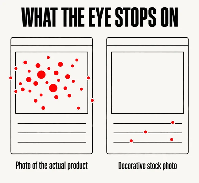
The question has an unusually old and unusually settled answer. Nielsen Norman Group has been running eyetracking studies on it since before most business websites existed, and the finding has not moved: users pay close attention to photos and other images that contain relevant information but ignore fluffy pictures used to “jazz up” web pages. Not glanced at briefly. Ignored.
What does get examined is specific: photos of products, and photos of real people — as opposed to stock photos of models. The distinction NN/g draws is the whole of it: the key point is that these are real people who actually work at the company. A portrait works because it is evidence. The same frame filled by somebody who has never been to your office is not a weaker version of that; it is a different thing, and visitors sort the two faster than they can explain why.
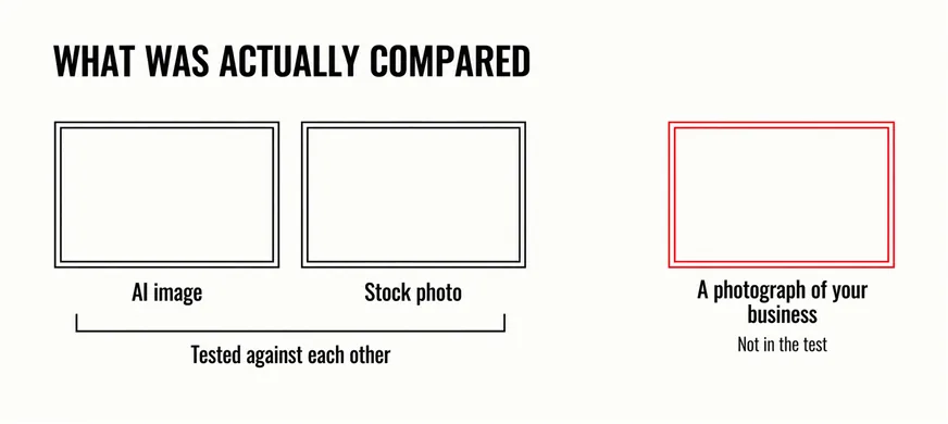
Which raises the question everyone asks instead. NN/g published a study on it in August 2026: 77 participants rated six versions of one fictional consulting firm’s page, differing only in the hero image — three AI-generated, three stock — after ten seconds each, without being told AI was involved. The result is that the AI-generated images were not at a disadvantage, scoring slightly higher on all three measures and reaching significance only for authenticity.
Read what that compared, though. AI against stock: a picture of nobody in particular against a different picture of nobody in particular. A photograph of your own premises was never an option, so the study cannot tell you it would have lost — and the older eyetracking work says it is the only one of the three that gets looked at.
An AI image and a stock photo are the same bet placed twice: that a picture of nobody will do the work of a picture of you.
Assume one afternoon, one person with a recent phone, and no studio. That is enough for a business with a physical presence, and it is worth more than a licence to a library of ten million images, because none of those ten million contain your shop.
Technique matters less than people expect, but three things matter. Shoot near a doorway or a window with the ceiling fluorescents off, because mixed light is what makes a phone photo look cheap. Hold the phone level and step closer instead of zooming. And take ten frames of each subject rather than one.
There is a second cost, and it is the one left out of the argument about hiring a photographer. Images are the largest single part of what a visitor downloads. The Web Almanac’s 2025 measurements put the median mobile home page at 2.6 MB, of which 911 KB is images — more than JavaScript, more than fonts, more than everything else. At the ninetieth percentile it is 6,288 KB. That is not a design choice anyone made; it is a hero photograph exported at full camera resolution and dropped into a page builder.
It is also the thing Google times. Images continue to dominate LCP elements across both device types, with 85.3% of desktop pages and 76% of mobile pages having an image as their LCP element — so on three quarters of mobile pages, the moment the browser decides the page has loaded is the moment one photograph finishes arriving. On phones only 62% of sites reach a good score for that measurement, and 13% are scored poor.
Put that next to how your site is actually read here: a mid-range Android, one or two bars of 4G, in a car park or on the LRT. A 4 MB hero image is not slow there. It is absent, and the visitor leaves before the argument you paid a photographer to make has rendered.
The fixes take an afternoon of their own. Export at the size the image actually displays — about 1,600 pixels wide covers a full-width hero on almost any screen — and save as WebP rather than a camera JPEG. Give every image explicit width and height attributes so text stops jumping as pictures land. Never lazy-load the image at the top of the page: lazy loading is for what is below the fold, and applying it to the hero delays the exact thing being measured. The wider version of this argument is in our piece on which design trends are worth their cost.
Before commissioning anything, spend an hour on what is already there. Most of what is wrong is findable from a browser and a right-click.
What this is not is a credibility review. Photographs are one signal among several — addresses, prices, consistency, load speed — and the rest are covered separately in what visitors check before they contact you.
For premises, process and work in progress, yes, and it has been for several years. A recent mid-range phone in decent daylight produces a file far larger than any website needs. Where a phone struggles is low light, fast movement and anything needing controlled lighting — in practice food, jewellery, reflective products and formal portraits. Shoot the easy four fifths yourself and pay someone for the rest.
They are a reasonable replacement for stock, which is what the evidence compares them against, and a poor replacement for a photograph of something real. Use them where you would otherwise have used an illustration or a background — not for anything a customer could read as a claim about your premises, your team or your work. Presenting a generated scene as evidence of those is a misrepresentation.
Fewer than most template sites carry. A homepage, three or four service pages and an about page are well served by eight to fifteen images, provided each shows something specific. The common failure is not too few photographs. It is thirty interchangeable ones, none of which a visitor can use to decide anything.
The sites we are asked to look at rarely need more images. They need fewer photographs, taken at the address on the contact page, exported at a sensible size and placed next to the text they belong to. Our creative and brand design service covers the shot list, the art direction and the production, and the web work to serve the results properly. If you cannot point to one photograph on your site that could only have been taken at your business, start there.