
- Resources
Innovative Thinking


Most website branding projects open with the logo, the palette and the typeface, and those are the parts everyone has an opinion about. The question a visitor actually asks first is duller and cheaper to answer: who is this, and why should I believe them? A site can be beautifully art-directed and still fail it.
The useful thing is that this is not a matter of taste. Google publishes the question set it uses to think about content quality, and the first of the three is simply who made it. That turns branding from an argument about colours into a short list you can work through in an afternoon.
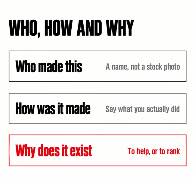
Who is behind the thing they are reading. Google’s guidance on helpful content frames it as three questions — Who, How and Why — and is direct about the first: “Is it self-evident to your visitors who authored your content?”. It asks, in the same place, whether pages carry a byline where one might be expected, and strongly encourages accurate authorship information. It also draws a hard line immediately afterwards: avoid deceptive authorship information.
The “Why” is the one that catches most business sites. The same page calls it perhaps the most important question to answer about your content, and distinguishes people-first content — made primarily for people rather than to manipulate rankings — from the alternative. A services page written to hit a keyword reads differently from one written to answer a customer, and both humans and ranking systems are fairly good at telling.
None of this is about E-E-A-T being a ranking lever, and it is worth saying plainly because the acronym gets sold that way. The documentation states that E-E-A-T itself is not a specific ranking factor. What it does say about priority is short: of experience, expertise, authoritativeness and trust, trust is the most important, and the others contribute to it.
Trust is not the reward for good design. It is the thing design is trying to carry.
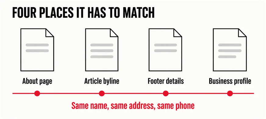
In four places, and they have to agree with each other. This is the part that costs almost nothing and is wrong on most sites we take over:
The machine-readable version of those details is structured data, which is worth adding and worth not over-promising. Google’s documentation says Local Business markup lets you tell it about business hours and departments, and that “Search results may display a prominent Google knowledge panel with details about a business that matched the query”. Note the may. The general guidelines are blunter: “Using structured data enables a feature to be present, it does not guarantee that it will be present”. Add it because it keeps your details consistent, not because it buys a result.
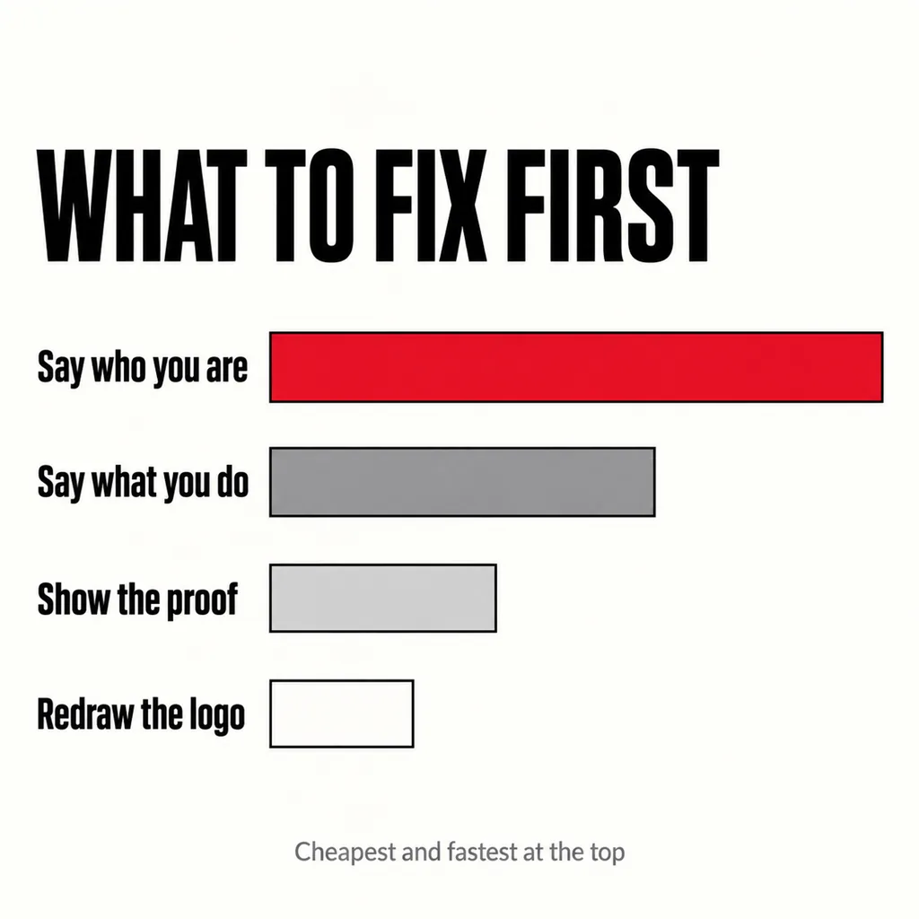
Cheapest and most load-bearing first. In the revamps we do, the order that pays back fastest is almost the reverse of the order people ask for:
| Order | The work | Typical effort |
|---|---|---|
| 1 | Say who you are — About page, bylines, real details | An afternoon, mostly writing |
| 2 | Say what you do, in the words customers use | A week of editing, no design needed |
| 3 | Show the proof — work, reviews, credentials | Ongoing, gathered not designed |
| 4 | Redraw the visual identity | A project, and best done last |
Steps one and two need no designer and change how the site reads immediately. Step four is real work worth doing — it simply does not fix anything the first three left broken. Which specific proof reassures a Malaysian buyer is covered in our article on website trust signals, and the photographs that carry it in whether your website photography is good enough.
Open your homepage on a phone and read only what fits on the first screen. If a stranger could not say what the business does and who runs it from that alone, no amount of visual identity will rescue it — the argument our article on what visitors see first on your homepage makes at length, and the reason a site can produce no enquiries while looking perfectly professional.
No, and the opposite reading is the one to avoid. Design is how all of the above gets communicated in the two seconds before anyone reads a word. A site that looks neglected undermines true claims; a site that looks current makes them easier to believe. The point is only about sequence — design carries the message, so the message has to exist first.
Where design pays back hardest is in clarity rather than decoration: navigation someone can use, pages grouped the way a customer thinks, answers given before the argument. Those are covered in fixing structure rather than content and answer-first service pages. Which current visual conventions are worth adopting, and which are fashion, is in web design trends worth using.
No — the test is whether a reader would expect one. Articles, guides and opinion pieces normally warrant a name; a pricing page or a contact page does not. Google’s wording is to add authorship information where readers might expect it, and to avoid inventing it. A fabricated author with a stock headshot is worse than none at all.
It makes you look real, which is the more useful property. Buyers of professional services are usually choosing a person as much as a company, and a named, contactable human is a stronger signal than a plural pronoun. If scale is a genuine concern, show the work rather than hiding the team.
Rarely in that order, and rarely at the same time. A rebrand that happens before the messaging is settled tends to get redone. Fix what you say first, confirm it works on the current site, then redesign around a message you have already tested. That also makes the design brief far easier to write.
A site that cannot say who runs it does not need a new logo; it needs three pages rewritten and its details made consistent. That is the first thing our creative and design service looks at, because it costs the least and changes the most. If the structure underneath is also fighting you, our guide to choosing between a revamp and a full rebuild sets out how to tell which problem you actually have.