
- Resources
Innovative Thinking


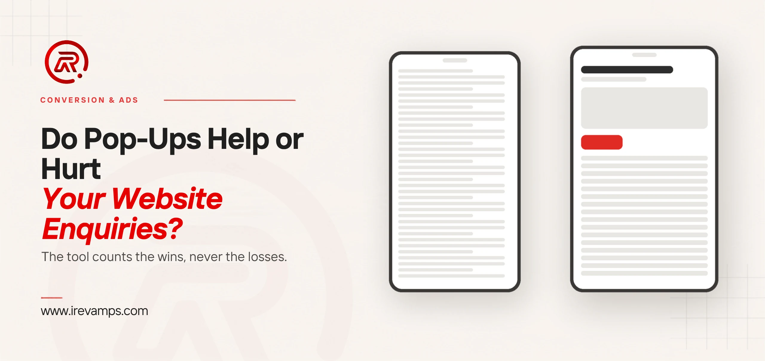
Website pop-ups help when they arrive after a visitor has shown some interest and carry the thing that visitor was already reaching for. They hurt when they cover the content before anything has been read, which on a phone is most of the time. The common failure on a Malaysian SME site is a newsletter box over a services page: an email list nobody writes to, bought with the enquiries that page was there to collect.
Answer it with your own numbers rather than the plugin’s. Every pop-up tool reports how many people filled the thing in, and none of them reports the enquiry that never happened because someone pressed Back instead. Those two figures live in different places, so a pop-up can look like a clear win on its own dashboard while the phone rings less than it did.
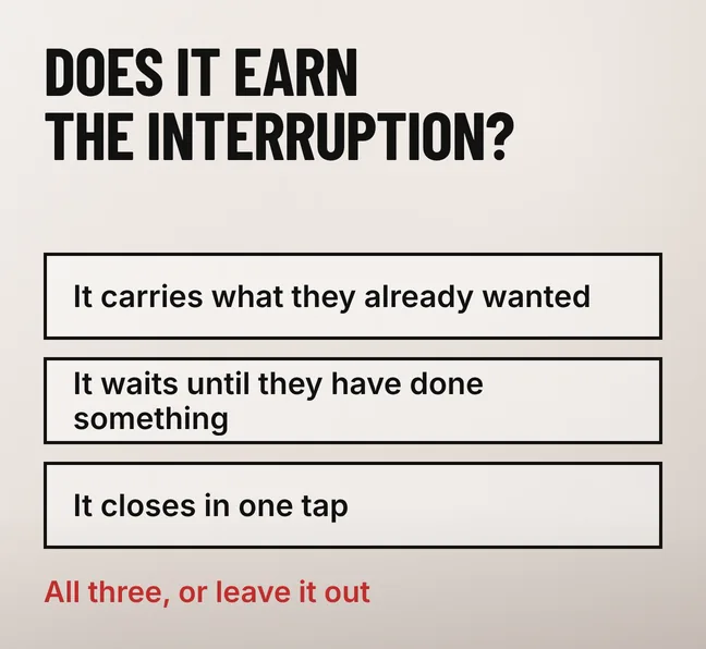
A pop-up earns its interruption when it passes three tests: it carries something the visitor already wanted, it waits until they have done something that shows interest, and it closes in one tap. A delivery-area checker that appears after two product views passes all three. A newsletter box on page load passes none of them.
Timing is where most of them fail, and it is the first thing Nielsen Norman Group raises in its review of ten problematic pop-up trends and what to use instead. Its position from its own usability work is flat: “From conducting decades of user research, we know that people dislike popups and modals.” The first three faults it names are all about the moment rather than the design — a pop-up before the page content loads, one straight after login, and an email request before the visitor has interacted with anything at all.
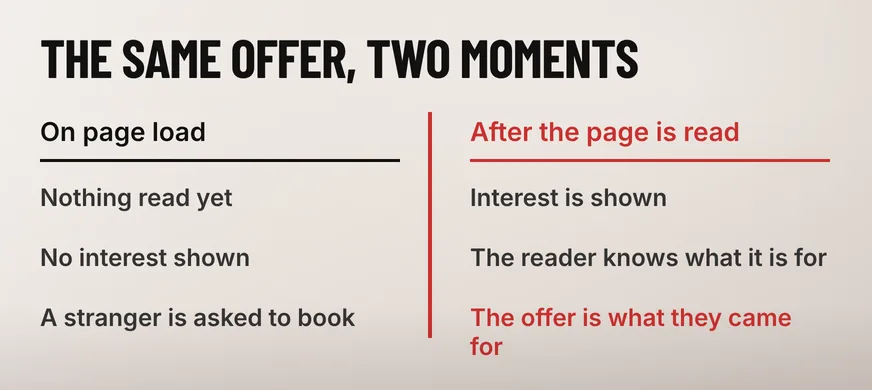
The same offer can be welcome or hostile depending only on when it fires. A dental clinic in Petaling Jaya takes most of its enquiries by phone and WhatsApp. An appointment pop-up shown to someone who has read a whole treatment page is handing that reader the next step they were looking for. The identical pop-up two seconds into the homepage is asking a stranger to book a procedure they have not read about yet.
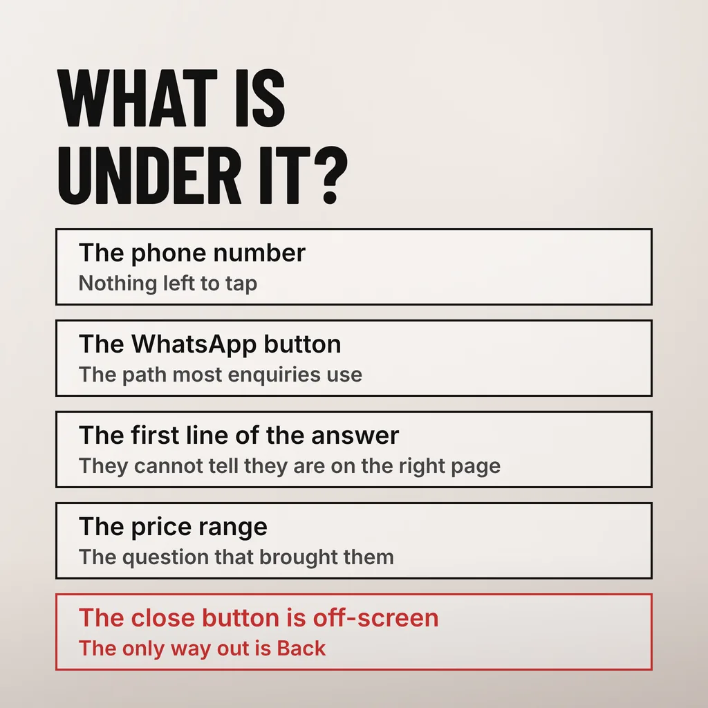
A pop-up costs enquiries when it covers the content on the first screen of a phone, when it lands on top of a cookie banner so the visitor meets two overlays before any content, or when its close button sits outside the viewport. Each of those converts a reader who was nearly ready to contact you into a back-button press.
Yours is not arriving in a quiet room either. Nielsen Norman Group reports that its author captured every pop-up she met across several weeks of ordinary browsing and averaged 25 a week, so by the time a visitor reaches your services page the reflex to dismiss an overlay without reading it is already trained. A pop-up competes with that reflex before it competes with anything on your page.
Three mundane faults cause most of the damage on Malaysian SME sites, and all three are invisible on the desktop where the pop-up was built. A modal sized for a laptop renders on a mid-range phone with its close button off the bottom of the screen. A plugin set to fire on every page view shows the same box to someone who came back twice in one afternoon to find your address. And an overlay that blocks the page while a slow 4G connection finishes loading it leaves the visitor looking at a grey rectangle, which reads as a broken site rather than an offer.
This is a mobile usability problem before it is a marketing one, and it is worth checking the way the rest of the phone experience gets checked. If the pop-up is the only thing standing between a thumb and your phone number, the rest of making the site easy to use on a phone has been undone by one plugin setting.
Google documents intrusive interstitials as something to avoid rather than a penalty with a published weight. Its guidance says these elements “obstruct users’ view of the content” and “may lead to poor search performance”, and the remedy it gives is to shrink the thing rather than to drop the offer. A dismissible banner is compliant; a full-screen takeover is not.
The wording is worth reading as written, because it is narrower than the version that circulates. Google’s page on avoiding intrusive interstitials and dialogs says “Intrusive interstitials and dialogs are page elements that obstruct users’ view of the content”, warns that “interrupting users with intrusive interstitials may frustrate them and erode their trust in your website”, and gives the instruction in the imperative: “Don’t obscure the entire page with interstitials.” Its recommended replacement is specific: “Instead of full page interstitials, use banners that take up only a small fraction of the screen”.
Notices you are legally obliged to show are treated separately. On age gates and equivalents the same page states that “Mandatory interstitials are exempted from the guidelines discussed in this document”, so a liquor retailer’s age check is not the problem this guidance is about. What it is about is the promotional overlay that appears over an article a visitor arrived at from a search result.
Google publishes no threshold for how much of a screen is too much, and we have not measured a ranking movement caused by a pop-up on a client site, so treat any percentage you are quoted on this as somebody’s estimate. The practical reading is simpler than a ranking question anyway: an overlay that hides the answer a searcher came for is a bad page before it is a ranking risk.
Match the trigger to what the page is for. A service page that exists to produce enquiries should carry no on-load pop-up at all, while a blog post can take an offer once the reader is well into it. The trigger decides whether the pop-up interrupts a decision or follows one, and that is the whole difference.
| Trigger | Where it fits | What it costs you |
|---|---|---|
| On page load | Legally required notices only | Hides the answer before it can be read |
| After a time delay | Long articles, past the halfway point | Fires on people still working out where they are |
| At a scroll depth | Articles and product pages | Little, as long as it stays off the first screen |
| On exit intent | Desktop cart and quote pages | Nothing on desktop; unreliable on phones, which have no cursor to leave |
| On a click | Any page, for a form behind a button | Nothing — the visitor asked for it |
| Two at once | Nowhere | Two dismissals before any content, and usually the visit |
Scroll depth and click are the two triggers worth defaulting to on a phone, because neither can obscure content the visitor has not reached yet. Exit intent reads mouse movement towards the browser chrome, which does not exist on a touchscreen, so a plugin advertising exit intent on mobile is firing on something else — a scroll upwards, or a timer — and firing it on people who were still reading. Keep exit intent for desktop and give the phone a scroll trigger instead.
Count total enquiries from every path for four weeks with the pop-up switched off, then four weeks with it on, and compare those two totals rather than the pop-up’s own conversion rate. Enquiries arrive by form, by phone, by WhatsApp and sometimes in person. A pop-up tool can only see the one channel it owns.
Write the numbers down before you start, because the comparison is worthless if one of the channels was never being counted. Most SME sites can assemble this in an afternoon:
Keep the two windows comparable. Four weeks against four weeks, neither of them spanning Hari Raya, Chinese New Year or the school holidays, and no other change to the site in either period. We have not measured a general figure for what a pop-up costs in enquiries, and we would not trust one if we had: it depends on the page, the offer and the trigger. The method answers it for your own site, which is the version of the question you can act on.
A thin bar at the top or bottom of the screen does the same job without covering anything, and it is what Nielsen Norman Group recommends in place of a modal that blocks an article. On most Malaysian SME sites a sticky WhatsApp button beats both, because that is the path the enquiries already take. Google’s own suggested replacement is the same small banner.
Whatever replaces the pop-up, keep what it asks for short. An offer that earns a tap and then presents six fields loses the visitor at the second one, which is the same arithmetic that applies on the page itself: we have written about what a contact form asking for too much costs you.
Not on their own, but a full-screen one over the content can. Google’s guidance on intrusive interstitials says such elements obstruct the visitor’s view of the content and “may lead to poor search performance”, and recommends a banner taking up only a small fraction of the screen instead. A click-triggered modal or a thin sticky bar sits outside that warning entirely, because neither covers the page a searcher arrived to read.
Yes, but not on load and not over the first screen. Use a scroll or click trigger, keep the box inside the viewport so its close button is always reachable with a thumb, and never stack it on a cookie banner. Test it on a mid-range Android phone rather than a desktop browser window narrowed to phone size, because the two do not render overlays the same way.
Long enough that the visitor has done something. A delay alone is a weak proxy for interest, so prefer a scroll depth of around half the page or a second page view. Nielsen Norman Group’s first three problematic trends are all premature triggers, including an email request made before the visitor has interacted with anything. If you must use a timer, put it well past the point where a reader would have finished the opening section.
A pop-up is a trade, and it is worth knowing which side of it you are on before leaving one running for another quarter. Our digital marketing and ads service covers the offers, triggers and landing pages that decide whether an interruption pays for itself. One thing to do this week: open your own site on your phone, on mobile data, and count the taps between the search result and your phone number.