
- Resources
Innovative Thinking


Lists of reasons a homepage does not convert run long: slow loading, weak call to action, no social proof, too many options, poor mobile layout. Most are real. Most are also downstream of one thing that happens in the first seconds, before speed or buttons get a chance to matter — the visitor could not tell what the business does, or whether it was for them.
Website copywriting is usually treated as the polish applied at the end. On the first screen it is the structure. This article gives you one test that takes five seconds to run, the research on why those seconds decide the visit, and what to rewrite when the test fails.
Because the decision to stay is made that fast, and it has been measured. Nielsen Norman Group’s analysis of how long users stay on web pages found that the first ten seconds of a visit are critical to the decision to stay or leave, that the probability of leaving is highest in those seconds because users arrive sceptical, and that to gain several minutes of attention you must clearly communicate your value proposition within ten seconds. Pages with a clear proposition held people; pages without one lost them.
Ten is the research figure. We test at five, and the reason is practical rather than scientific: on a phone, five seconds is about what the first screen gets before the thumb moves. Whatever has not been understood by then is being scrolled past, not read.
Ten seconds is the research. Five is what the first screen gets before the thumb moves.
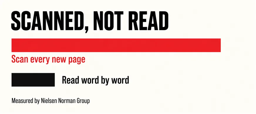
The second measurement explains the first. In NN/g’s study of how users read on the web, 79 percent of test users always scanned any new page and only 16 percent read word by word. A homepage written to be read is being scanned, so the three or four words a scanning eye lands on carry the whole message. What visitors should see first covers the layout side; this is the words side of the same problem.
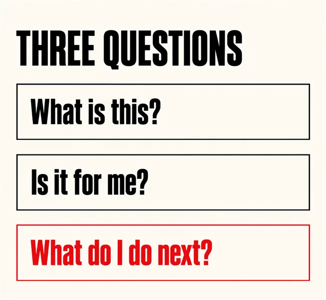
What is this? Is it for me? What do I do next? Every visitor answers all three, in that order, in the first screen, whether or not the page helps them. A page that passes gives each question an obvious answer in the words the visitor would use. A page that fails makes them work for one of the three — usually the first.
The commonest failure on Malaysian business sites is a headline that could belong to any company. “Your trusted partner in digital solutions” answers none of the three questions. “Website revamps for Klang Valley clinics and law firms, without a rebuild” answers all three: what, for whom, and by implication what next. The second line is less elegant, and the one a scanning eye can use.
The second question, “is it for me”, is where naming a customer type pays off and where businesses are most reluctant to, for fear of turning others away. The scanning research suggests the opposite risk is larger: a page for everyone reads as for no one, and your actual customer leaves unsure. Out-specifying a marketplace makes the same argument for product businesses.
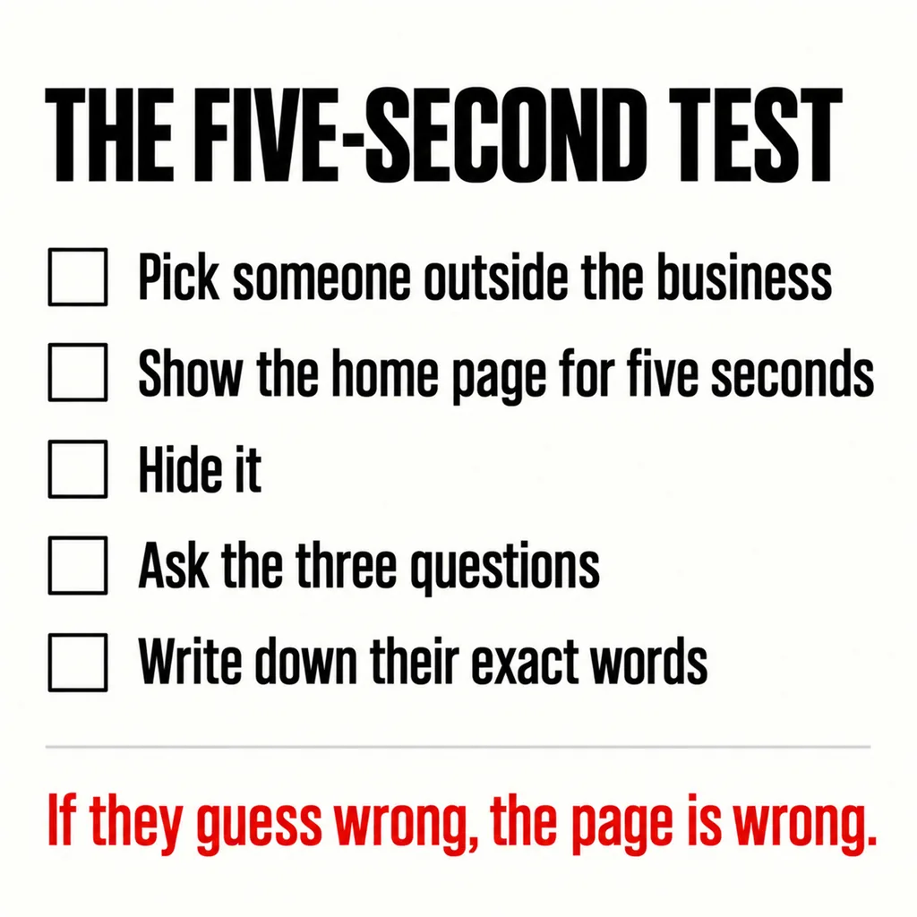
Find someone who does not work in the business — a friend, a spouse, a customer you trust. Open the homepage on a phone. Show it to them for five seconds, then take it away and ask the three questions. Write down their exact words, not your summary of them, because the words they choose tell you which of yours landed.
Then score it honestly: what you do, in roughly a customer’s terms, passes the first question; who it is for, the second; what they would click, the third. Two out of three is a page worth editing; one out of three, a page worth rewriting. Three people give a better reading than one, and the test takes a minute each.
At the front of everything. NN/g’s work on the F-shaped reading pattern — reading the first lines fully, then scanning down the left edge — leads to advice that is unfashionable and correct: put the most important content in the first two paragraphs, make headings look more important than body text, and start headings with the words that carry the information. “Our approach to website revamps” buries the word that matters; “Website revamps: what we keep and change” leads with it.
The same rule governs navigation labels, the most-scanned words after the headline. “Solutions” fails the five-second test on its own; “Website revamp”, “SEO” and “Pricing” pass. Website structure, not content makes the case that this is a structural decision as much as a writing one.
There is a secondary search-engine reason too. Google’s guidance on people-first content asks whether a page is written for a person with a real need rather than to attract search engines, and a first screen that answers the three questions plainly is the one an assistant can quote, as answering the questions customers actually ask sets out.
| If they could not say… | Rewrite | In how many words |
|---|---|---|
| What you do | The headline, naming the service in the customer’s words | Eight to twelve |
| Who it is for | The subheading, naming the customer type or the problem | One sentence |
| What to do next | The button, naming the action and what happens after it | Two to four |
| Why to believe you | One line of specific proof beside the button | One fact |
Four lines — the entire first screen, and where almost every homepage rewrite we do spends its first hour. The rest can wait until those four pass, which is also the argument in whether to revamp the site or fix the homepage. Say who is behind the business while you are there; who is behind your website is answered in the same few seconds.
Then run the test again with a new person. If it passes and the enquiries still do not come, the problem has moved — to the route onto the page, as in the page nobody can find, or to what happens after the click, as in why visitors come and nobody contacts you.
No, and it does not claim to. It judges the first screen, which decides whether the rest is ever seen. A visitor who passes the first five seconds gives you minutes; one who does not gives you nothing. Fix the first screen first because it gates everything else.
Only if it is also the word a customer would use, which it usually is — people search for what they call it. A headline written plainly for a customer usually contains the keyword without trying; one stuffed to contain it reads as exactly that, to people and Google alike.
Lead with the one most visitors came for, and name the others in the subheading or navigation. A headline listing five services answers the first question with a menu, and the scanning eye does not read menus. Pick one and let the structure carry the rest.
The five-second test is the first thing we run on a site we are asked to revamp, usually with someone from the client’s front desk, and it settles many design arguments before they start. Our web development and design service treats the first screen’s four lines as the brief for everything beneath — and when the words were the problem all along, it is the cheapest fix a website can get.