
- Resources
Innovative Thinking


Website accessibility is usually explained with principles — perceivable, operable, understandable, robust — and then left there, as something a specialist will one day assess. The principles are right. They are also not a thing a business owner can do on a Wednesday afternoon.
This article is the other half. Four checks you can run on your own site this week, each tied to the published threshold it tests, and the one number that says how likely you are to fail them. None of it needs a consultant. Most of it needs a phone and a keyboard.
The W3C, which writes the standard, defines it in one sentence in its introduction to web accessibility: websites, tools and technologies designed and developed so that people with disabilities can use them — perceive, understand, navigate and interact with the web. The practical version for a business site is narrower: can someone with weaker sight, an unsteady hand, or no mouse find your services and send you an enquiry?
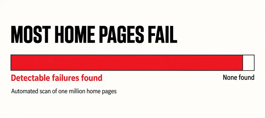
How often the answer is no has been measured. WebAIM runs an automated check across the home pages of the top one million websites every year, and the 2026 edition found that 95.9% of home pages had detected WCAG 2 failures, up from 94.8% the year before. That counts only failures a machine can detect, so the true rate is higher — and those home pages had far more money behind them than most Malaysian business sites, which is why to assume yours is in the 96% until you check.
Assume your site is in the ninety-six per cent until you have checked.
The failures the scan finds most often are not exotic. Low-contrast text, images without alt text, form fields without labels, empty links. Each is a few minutes to fix and each is caught by one of the four checks below. The mobile version of the same problem — a page that fits the screen but cannot be used on it — is in a mobile-friendly site that is hard to use.
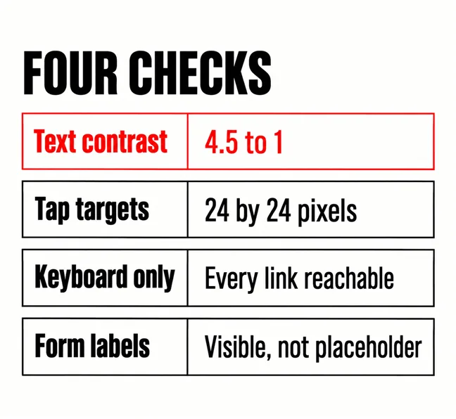
The standard’s contrast minimum is a number: ordinary text needs a contrast ratio of at least 4.5:1 against its background, and large text at least 3:1. Light grey body copy on white — the signature of a certain kind of modern design — routinely lands at 2.5:1 or worse, which is why the people who commissioned it find it elegant and their older customers find it unreadable.
You do not need to calculate anything; your browser does. In Chrome or Edge, right-click any text, choose Inspect, and the colour swatch in the styles panel shows the ratio and whether it passes. Check body text, footer, button text, and anything set over a photograph. A hero headline over an image is where most sites fail first; which photographs get looked at covers the photograph side.
The fix is almost always a darker grey, not a different design — pale text is among the design trends worth skipping.
The threshold here is also published. WCAG 2.2’s target size minimum requires that a tap target be at least 24 by 24 CSS pixels, unless the spacing around it compensates. That is the floor — the size a steady hand on a good day manages — and page-builder default buttons, header icon links and the tiny “x” on a popup all tend to sit below it.
The test is a phone and your least steady hand. Try every link in the navigation and every button on the home page, and notice where you have to aim; anything you miss once, a customer misses regularly. The same check catches footer social icons and the pagination under a product grid, which is where online stores lose orders on small screens.
The fix is padding: space around the link that also responds to the tap. The call to action deserves the most generous target on the page.
Put the mouse down, click once in the address bar, and press Tab repeatedly. A visible outline should move through every link, menu item and button in a sensible order, and Enter should activate each. If the outline vanishes — a designer removed it as ugly — the site is unusable for anyone navigating by keyboard, including users of many assistive devices. If it skips a menu that only opens on hover, the services pages are unreachable. Restoring the outline is a one-line change; the menu usually needs a developer.
The fourth check is the contact form. Click into a field and start typing. If the field’s name was grey text inside the box that disappeared when you typed, the form has placeholders instead of labels, which screen readers frequently do not announce. Every field needs a visible label above it. Then confirm each has an accessible name by tabbing to it and checking the browser’s audit panel, which flags unlabelled inputs by default.
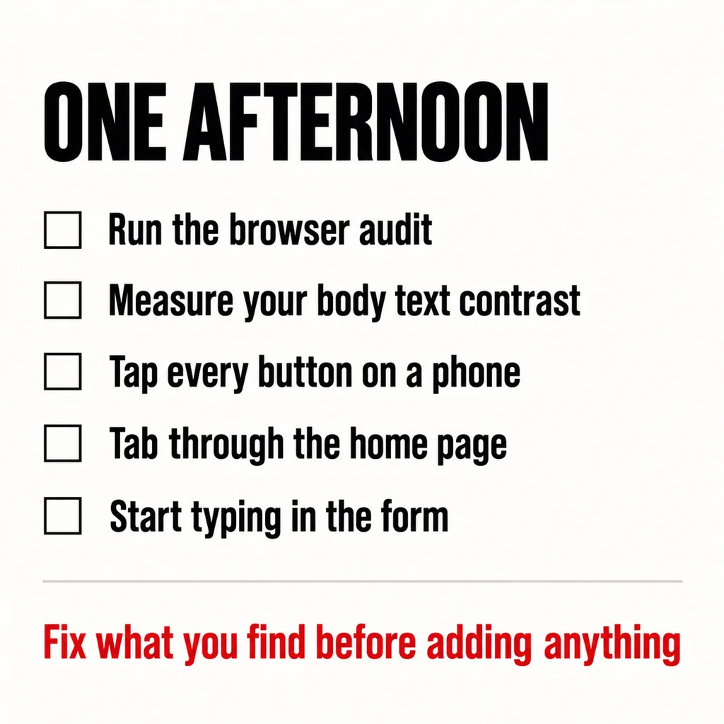
All four are also covered, roughly, by the audit built into Chrome and Edge: open the developer tools, choose Lighthouse, tick Accessibility, and run it on your home and contact pages. Treat the list it produces as the to-do and the score as noise — automated tools detect the same subset WebAIM’s scan detects, so a high score means “nothing a machine could find”, not “accessible”. The four manual checks are what the machine cannot do.
| Step | Tool | What a fail looks like |
|---|---|---|
| Run the browser audit on home and contact pages | Lighthouse, Accessibility | A list of unlabelled fields, missing alt text, low contrast |
| Measure the body text contrast | Inspect, colour swatch | Below 4.5:1 on ordinary text |
| Tap every button and link on a phone | Your phone, your worse hand | Anything you miss or hit by accident |
| Tab through the home page | Keyboard only | No visible outline, or the menu skipped |
| Start typing in the contact form | Any browser | The field name disappears |
Fix what you find before adding anything, because the fixes are small — a darker grey, more padding, a restored outline, a label — and new sections on a page that fails them spread the failures. It is the same order of work as the website mistakes worth fixing first: cheap structural corrections before visible ones. Where the problem is the page builder’s defaults rather than your choices, what a builder costs after the build is the longer conversation.
One note on scope: a page in a second language must declare that language for a screen reader to pronounce it, which sits with how a Malaysian site should handle two languages.
We will not assert a legal position we have not verified, and this is not legal advice. The case here does not depend on it: the four checks remove barriers for customers you already have — older customers, customers on cheap phones, keyboard users — and each fix is small. If a requirement applies to your sector, these checks are the beginning of meeting it.
No. An overlay adds a floating toolbar that changes contrast or font size for the visitor who finds it; it does not add missing labels, restore a removed focus outline, or enlarge a tap target. The four checks above fix the page itself, which is what the standard measures and what a customer actually experiences.
We will not quote a figure, but what drives one is the number of page templates, whether forms and checkout are custom, and how much sits inside a page builder. The afternoon above costs nothing and finds most of what a paid audit lists first — run it before commissioning one.
These four checks are part of the audit we run before any revamp, because a redesign that inherits a 2.5:1 grey and a hover-only menu has redesigned around its biggest problems. Our web development and design service builds to the thresholds above as a baseline, not an add-on — and the trust signals visitors notice first are mostly the same things: text they can read and buttons they can press.