
- Resources
Innovative Thinking


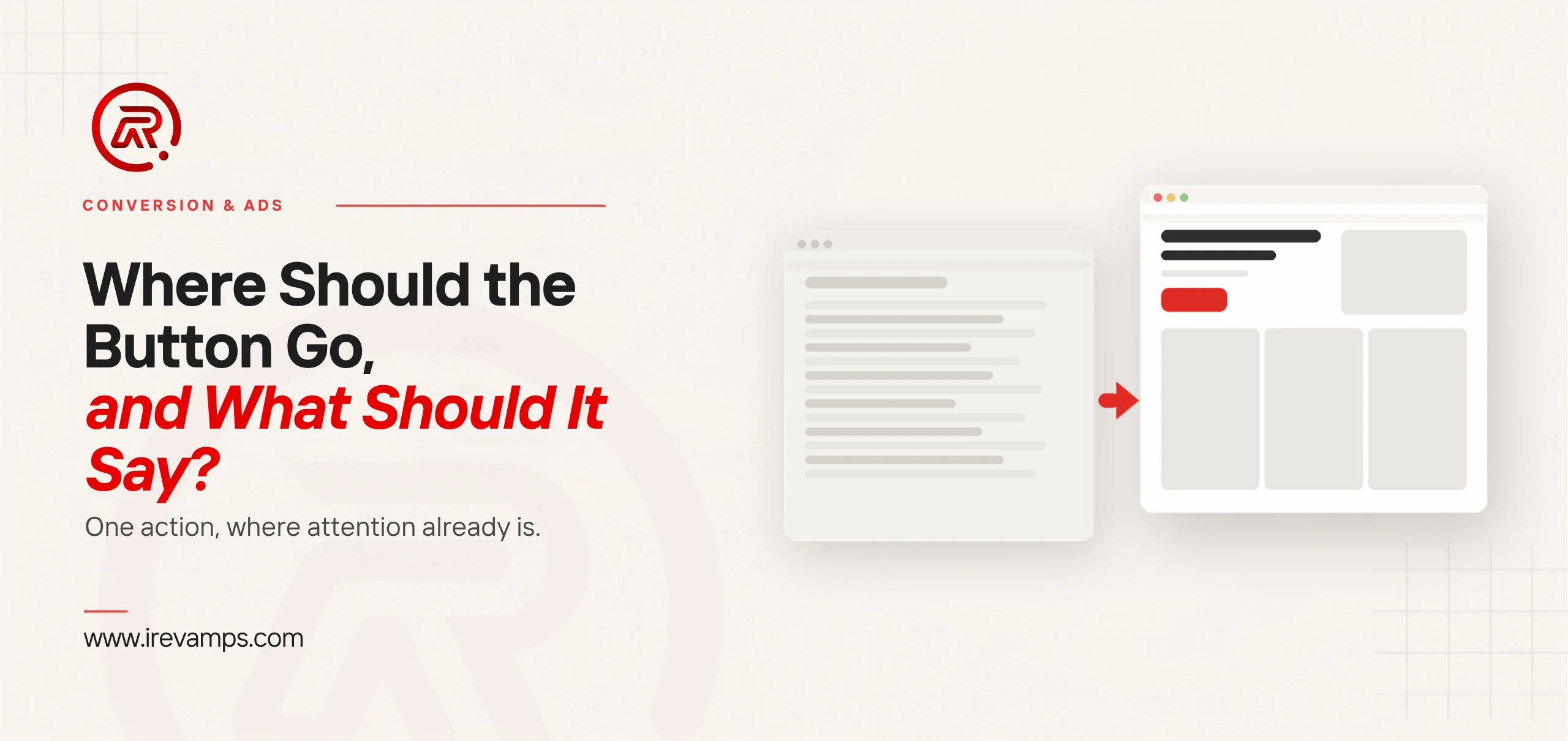
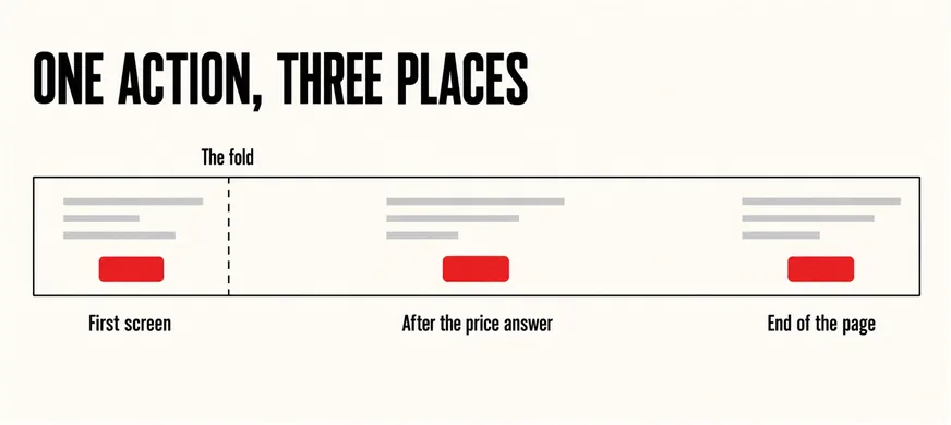
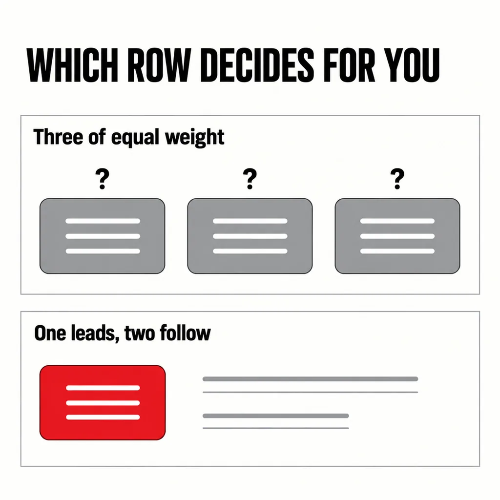
A call to action works when there is one of it, when it sits where the reader is already looking, and when it says what the visitor gets rather than what your form does. Most business sites we revamp do not have too few buttons. They open with three of equal weight — Get a Quote, View Portfolio, Learn More — so the first screen asks the visitor to choose between choices instead of choosing for them.
That is a layout problem with a cheap fix, separate from the broader question our article on why your website gets no enquiries takes apart. This one stays on the button.
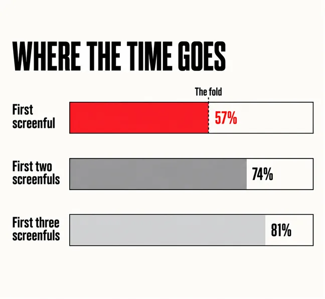
Where people are already looking, which is nearer the top than most layouts assume. Nielsen Norman Group tracked more than 130,000 eye fixations and found that “users spent about 57% of their page-viewing time above the fold”. Two screenfuls in, that reaches 74%; three in, 81%. The study’s own instruction: keep major calls to action above the fold.
In 2010 the same team measured 80% above the fold; by 2018 it was 57%, as long pages spread. People scroll more than they did, but rarely past the third screenful. The fold is no longer a wall. It is still the best seat in the house.
Because two buttons of equal weight are a question, and a question is slower than an instruction. NN/g puts the mechanism bluntly: “People have difficulty picking out the clickable elements when similar-looking items compete with each other”. It also warns against making things that are not clickable look like buttons.
On a typical Malaysian SME homepage that is a hero with Get a Quote, WhatsApp Us and View Our Work side by side, all the same colour and size. Each is defensible alone. Together they split the attention the first screen earns, and the visitor resolves the tie by scrolling.
The fix costs nothing but nerve. Pick the action worth most to the business and let it be the only thing shaped like a button; everything else becomes a plain text link, which still works for the minority who want it. If you cannot decide which wins, the page is trying to serve two visitors, and the better answer is two pages — the argument our article on sending ad traffic to a homepage or a landing page makes for paid traffic.
A scarlet button beside a grey text link is a hierarchy. Two scarlet buttons are a coin toss.
What the visitor gets, in their words, in four words or fewer. NN/g is direct about the failure mode: “Avoid generic labels such as Continue or Next”. A label describing your internal process — Submit, Send Enquiry, Register — says what the database will do. One describing the outcome says what they will have.
| Weak label | Why it stalls | Stronger |
|---|---|---|
| Submit | Describes the form, not the result | Get My Quote |
| Learn More | Promises reading, which is a cost | See What a Revamp Involves |
| Contact Us | Opens an unbounded conversation | WhatsApp Us About Your Site |
| Register | Sounds like paperwork | Book a Free Site Review |
The WhatsApp row is not decoration. In the Malaysian businesses we revamp, WhatsApp is usually the real enquiry path, and a chat button gets used where an eight-field form does not — an observation from our projects, not a statistic. If that is your route, label the button so.
A flat rectangle in a pale brand tint, with no border and no shadow, reads as a heading. The same guidance lists five states worth distinguishing — enabled, disabled, hovered, focused and pressed — and asks that the pressed state appear within 100 to 150 milliseconds. Otherwise people tap twice, which is how duplicate enquiries arrive.
Two numbers matter, and they answer different questions. Google’s guidance for developers sets the practical floor: “A minimum recommended touch target size is around 48 device independent pixels”, because that area “corresponds to around 9mm, which is about the size of a person’s finger pad area”. It also asks for roughly 8 pixels between adjacent targets.
The accessibility requirement is separate and lower. WCAG 2.2 adds a Level AA criterion, Target Size (Minimum), asking that “The size of the target for pointer inputs is at least 24 by 24 CSS pixels”, with exceptions where undersized targets are spaced far enough apart. Treat 24 as the line you must not fall below and 48 as the size to build; an icon drawn at 24 pixels can still carry a 48-pixel tap area with padding.
Check this on a real handset, not a desktop window squeezed narrow. How a site behaves under a thumb is in our article on whether your website is easy to use on a phone; in a checkout the stakes are higher — see why Malaysian stores lose carts at the last step.
The button is a promise, and the page after it either keeps the promise or wastes the click. A button reading Get My Quote that leads to a bare contact form with no indication of what happens next has spent the visitor’s decision and given nothing back. What a good reply looks like, and how fast it has to be, is the subject of our article on what should happen after someone submits your form.
Two things also sit between the button and the enquiry: whether the visitor believes you, which our article on website trust signals covers, and where they arrived from, since a visitor sent by a social post has different expectations from one who searched — the point of making social traffic close the sale on your site.
In this order, because each step is cheaper than the one after it:
To know whether it worked rather than assuming, our article on auditing a landing page without guessing sets out what to measure.
Contrast matters; the particular colour mostly does not. A button needs to stand out from what surrounds it, which is a question about the rest of your palette. A scarlet button on a page of scarlet headings disappears. The common mistake is not the wrong colour but giving three actions the same one.
Sometimes, and more often on phones than desktops. A single sticky bar carrying one action can work on a long page where the decision point is far from the top. But it costs vertical space on a small screen, and must not cover what the visitor is reading.
The same one action, phrased for that page. A service page and a blog post are read at different stages, so wording and urgency differ, but the action should not change. A visitor who meets a different request on every page learns the site does not know what it wants.
A page that asks for three things at once does not need rebuilding. It needs one decision made and applied — the smallest useful kind of revamp, and where our digital marketing and ads service starts, because paid traffic makes a vague call to action expensive rather than merely quiet. If the button is fine and the problem is everything around it, our guide to a revamp or a full rebuild sets out how to tell.