

- Resources
Innovative Thinking



Lists of website mistakes all name roughly the same four problems — slow pages, a weak call to action, confusing navigation, nothing designed for a phone — and they are right to. Those are the faults we find most often too. The trouble is the numbers bolted onto them. The same figures circulate from list to list: 40% of visitors leave after three seconds, 88% never return after a bad experience, one second of delay costs 7% of conversions. Follow any of them back and the trail stops at another list.
That matters, because you cannot act on a number you cannot check. So here are the same problems with the figures Google actually publishes — and one claim that is repeated so often it has become folklore, which its own source contradicts.
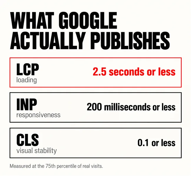
Not three seconds, because nobody official ever said three seconds. Google publishes a threshold, and it is a different number measured a different way. For Largest Contentful Paint — the moment the biggest thing on screen finishes drawing — the guidance is that “sites should strive to have Largest Contentful Paint of 2.5 seconds or less”. The same page defines what is being timed: LCP reports the render time of the largest image, text block or video visible in the viewport.
The measurement method matters more than the number. web.dev’s Web Vitals overview says the threshold should be judged at the 75th percentile of page loads, split across mobile and desktop. That is not a lab test on your own laptop. It means three quarters of real visits, on real phones and real connections, have to come in under 2.5 seconds — which is why a site that feels quick in the office can still be failing.
There are two other published thresholds worth knowing, and together they are the whole picture:
| Metric | What it times | Good |
|---|---|---|
| LCP | How long the largest visible element takes to draw | 2.5 seconds or less |
| INP | How quickly the page responds after a tap or click | 200 milliseconds or less |
| CLS | How much the layout jumps while loading | 0.1 or less |
Why the site is slow, and what to do about each cause, is the subject of our article on whether three seconds is really the limit.
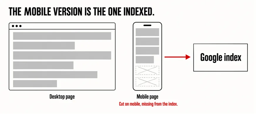
No — and this is the claim worth correcting, because the usual version of it is both unsourced and the wrong shape. Google’s mobile documentation contains no penalty, no deduction and no demotion. What it contains is this: “Google uses the mobile version of a site’s content, crawled with the smartphone agent, for indexing and ranking”. The same page is careful to say that a mobile version is not required for inclusion in Search, but that it is very strongly recommended.
Read that again, because the consequence is sharper than a penalty would be. The mobile version is not a lesser copy that Google checks second. It is the copy Google reads. Anything your theme hides on a small screen — a specification table, a block of service detail, the paragraph that answers price — is not demoted. It is simply not there to be indexed.
The mobile version is not the second copy Google checks. It is the copy Google reads.
That reframes the fix. It is not about scoring well on a mobile test; it is about content parity. Whether the thing is usable under a thumb is a separate question, and our article on whether your website is genuinely easy to use on a phone takes that one on.
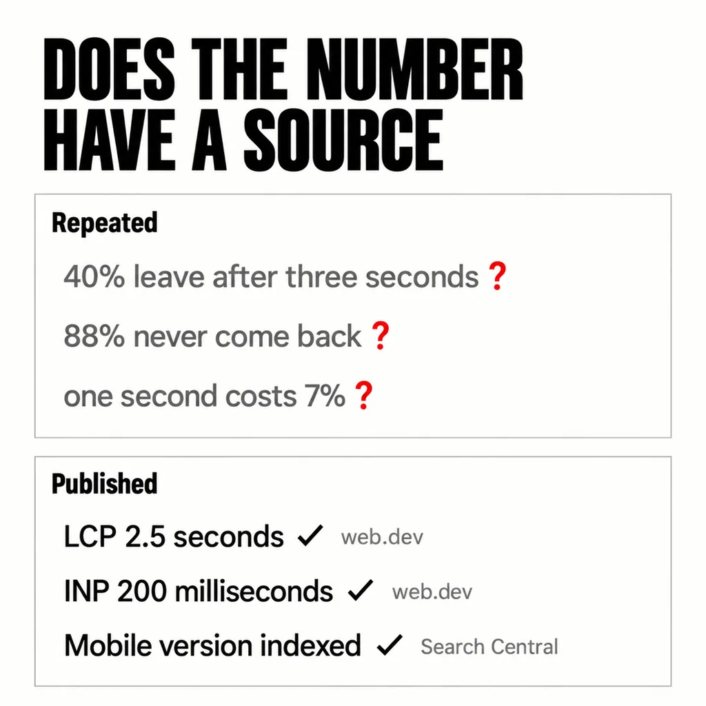
A figure is worth acting on when you can follow it to a named document and read the method. Apply that test to the usual list and most of it falls away. “88% of online shoppers won’t return” has no named study attached in any version we have read. “A software company saw a 200% increase” names no company, no period and no baseline, which makes it an anecdote in the costume of evidence.
The published figures survive the same test easily, because they come with their method attached. Google’s guidance on Interaction to Next Paint states that “An INP below or at 200 milliseconds means a page has good responsiveness”, and that above 500 milliseconds responsiveness is poor. The same page gives the reason it is worth measuring at all: Chrome usage data shows that 90% of a user’s time on a page is spent after it loads. That is a claim you can go and check, which is the only kind worth repeating.
The ones you can measure before and after. In the sites we revamp, these are the four that change the enquiry count most reliably:
If none of that is obviously your issue, the honest next step is to measure rather than guess, which our guide to auditing a page without guessing covers. And if the site produces no enquiries at all, the fault is usually earlier than any of these: why your website gets no enquiries works through it stage by stage.
It is not a published standard. Google’s own threshold is for Largest Contentful Paint and sits at 2.5 seconds or less, judged at the 75th percentile of real page loads across mobile and desktop. The practical difference is the measurement: three quarters of actual visits must clear it, so a site that loads instantly on office wifi can still be failing on a mid-range phone.
Not removed, but much of it may never be indexed. Google’s documentation says a mobile version is not required for inclusion in Search, while strongly recommending one. The real risk is content parity: because the mobile version is the one crawled for indexing, anything your layout drops on a small screen is not available to be indexed at all.
The Core Web Vitals figures come from real visits, so they are reported in Google Search Console under Core Web Vitals and in PageSpeed Insights, which shows field data alongside a lab test. Treat the field data as the real answer and the lab score as a diagnostic. Checking takes a few minutes and settles most arguments about whether a site is actually slow.
Almost none of this needs a new website. A site that loads slowly, hides half its content on a phone and buries its navigation usually needs those three things fixed, in that order, on the site you already have — which is what our web development and design service does most weeks. If the structure underneath turns out to be the real problem, our guide to choosing between a revamp and a full rebuild sets out how to tell the difference.