
- Resources
Innovative Thinking


Good ecommerce UX helps a shopper find a suitable product, understand the differences between options and choose with confidence. Start there when revamping an online store. A cleaner checkout cannot recover an order from someone who never worked out which item to put in the basket.
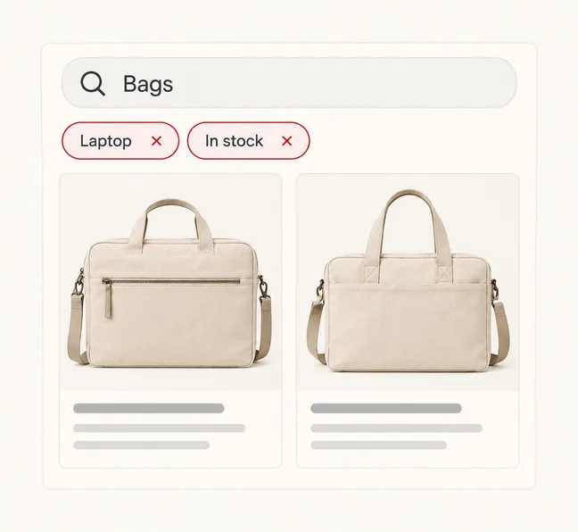
Consider a customer looking for a work bag that carries a laptop and closes with a zip. A beautiful homepage offers little help if the catalogue cannot narrow those choices and the product page never shows the inside. The useful design question is simple: what is stopping this person from deciding?
Choose one buying task from a real customer enquiry. Give it to someone unfamiliar with the store and watch where they hesitate. Let them start from a category, a search result or an advert; customers will not all enter through the homepage.
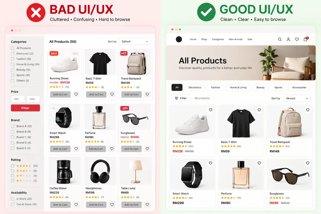
Use category names that describe the stock. A shop selling bags can explain “Backpacks” and “Laptop bags” immediately. An internal collection name such as “Urban Series” needs extra interpretation. Branded collections can stay, but shoppers also need a route based on what they want.
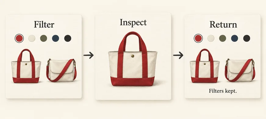
Baymard’s research on ecommerce filters supports category-specific filters, visible selections and preserving filter state when shoppers return from a product. Apply those principles to the attributes people actually use to choose. For bags, capacity and fastening may matter; for replacement parts, compatibility may decide the purchase.
Try this sequence on your phone: apply a filter, open a product, then go back. The selected filters should remain and the shopper should be able to resume browsing. Losing that work makes every comparison a restart. Where several colours are acceptable, allow more than one colour choice instead of making the shopper repeat the search.
Also search using the language in your enquiries, including alternative product names. Record searches that return nothing when the store carries a suitable item. Fix the catalogue labels or search configuration behind that failure before adding another promotional banner.
Nielsen Norman Group’s product-page guidance puts accurate information, recognisable images, clear options, availability and feedback near the centre of the buying decision. A product page has to answer questions that a shopper cannot resolve by holding the item.
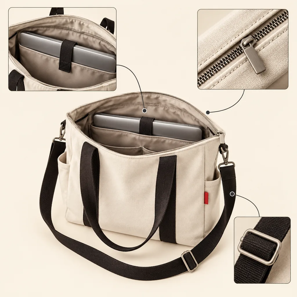
For our example bag, show the opening, the inside, the fastening and the shoulder strap. Put dimensions in consistent units and explain how laptop fit is measured. If fit depends on the device’s external dimensions, say so. “Fits most laptops” leaves the difficult part with the customer.
Build the description around questions your team already answers. Does the strap detach? Is there a separate compartment? Can the lining be cleaned? Answers belong beside the product, where the uncertainty arises. A WhatsApp button can help with unusual questions, but basic specifications should not require a conversation.
When someone changes a variant, make the selected option unmistakable and keep its image, price and availability consistent. Never leave a sold-out colour looking purchasable until the shopper presses the main button. If an option is unavailable, explain that beside the selector.
Use the same specification labels across related products. “Capacity” on one page and an unexplained model code on another force readers to interpret the difference. A small comparison table is useful when there are meaningful attributes to compare; filling one with repeated marketing adjectives adds no information.
A buyer may like the product and still be unable to commit. Delivery timing, regional coverage and the cost of returning an unsuitable item can change whether the purchase makes sense. Show the relevant information before asking for payment details.
For a Malaysian store, check whether the delivery explanation actually covers its served regions. If the service differs between Peninsular Malaysia, Sabah and Sarawak, present the real distinction. Do not display a single nationwide promise unless the fulfilment operation supports it.
If the final delivery charge depends on a postcode or basket contents, explain that and provide an estimate when your system can calculate one. Separate dispatch time from expected arrival. A ready-to-ship item and a made-to-order item need different explanations.
Keep the returns summary readable and link to the full policy. State the actual conditions, including exclusions. Real product reviews can clarify fit or use, but invented reviews, resetting countdowns and unsupported stock warnings undermine the evidence a customer needs.
Open a product on a mid-range phone using mobile data. Select an option, zoom a photograph and add the item to the basket. Check whether a promotion covers the controls, whether the page jumps while images load, and whether the basket confirms the chosen variant.
Then use a keyboard. Can you reach the filters, select an option and dismiss an overlay? Keep visible field labels and explain errors in words. W3C’s accessible forms tutorial covers labels, instructions and feedback; these principles apply to catalogue controls as well as address forms.
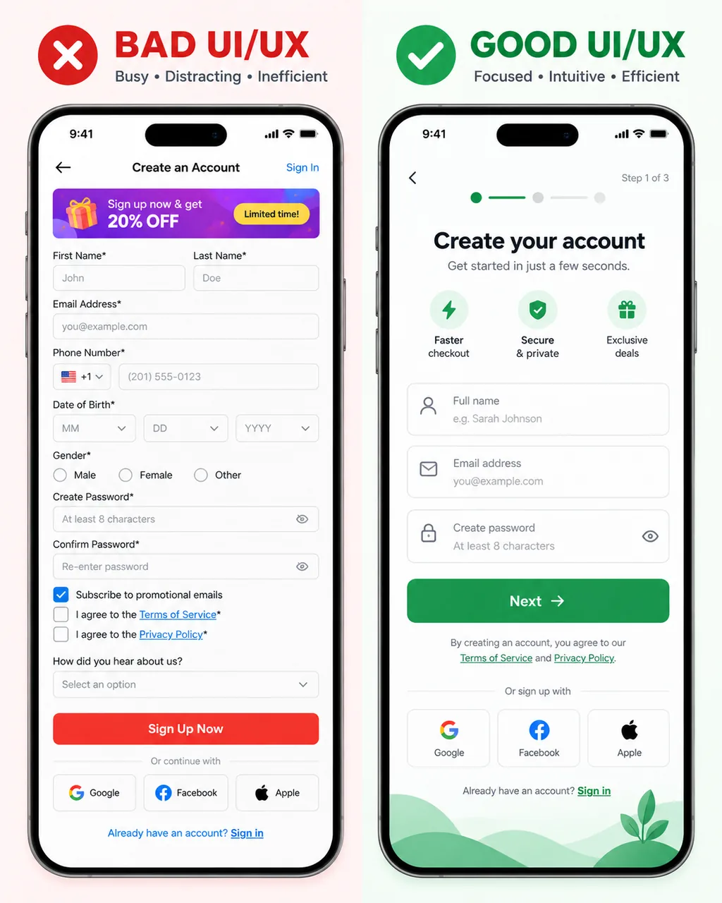
Speed needs a separate check. Google’s Core Web Vitals guidance distinguishes loading, responsiveness and visual stability. A page can appear quickly yet respond slowly to a filter, or move the purchase button while a banner loads. Record which behaviour fails rather than treating one homepage speed score as a verdict on the whole store.
Once the shopping journey works, continue with our checkout audit for Malaysian online stores. That covers the next stage, where a shopper has already decided what to buy.
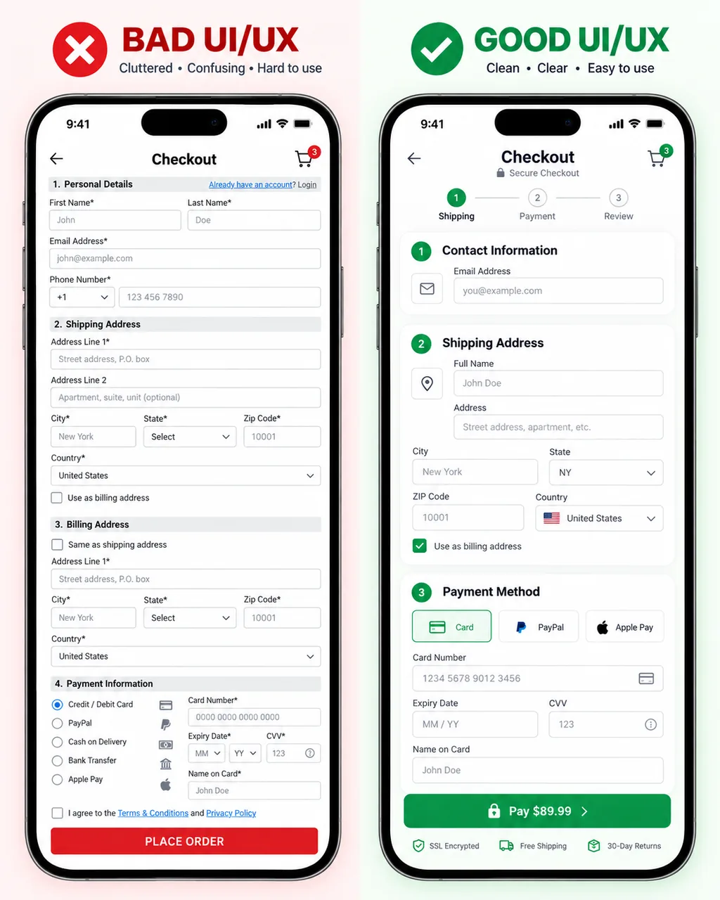
Keep a short issue list with evidence: the page, the task, what happened and what should happen instead. “Filters disappear after Back” is actionable. “The shop feels dated” still needs diagnosis.
Retest the same tasks after the changes. If analytics are configured correctly, compare product views, basket additions and completed purchases while checking for changes in traffic quality, stock and promotions. With a small store, direct observation and recurring support questions can be more useful than declaring a winner from a handful of orders.
These findings also define the project boundary. Category labels, product templates and filtering may be repairable within the existing platform. A replacement becomes more plausible when the platform cannot support the required catalogue or integrations. Our guide to choosing a website revamp or a full rebuild explains that wider decision.
Bring three difficult buying tasks, the affected pages and the product questions your team answers repeatedly. That gives a website design and development discussion a concrete starting point: the catalogue, templates and interactions that need attention. Agree how each fix will be checked before expanding the scope.
Background reading: Tubik’s 2017 UX Planet article on ecommerce design introduces the broader relationship between business goals, usability and presentation. The task-based review above applies that subject to an existing store, with additional guidance from the sources linked throughout.