
- Resources
Innovative Thinking


If customers keep asking questions your website already answers, the writing is probably not the problem. The pages exist. People are not reaching them. That is a website structure problem — how pages are grouped, what they are called and how they link to each other — and no amount of rewriting fixes it, because the better copy lands on the same pages nobody opens.
It is also the cheaper problem to have. Structure can be tested in an afternoon with a plain list of page names and a handful of people, before a designer is involved, and fixing it is mostly moving and renaming rather than writing from scratch.
In a monthly report the two look identical: pages with few views, a quiet enquiry form. They differ in one thing that the report does not show. A content problem is a page people reach, read and leave unconvinced. A structure problem is a page they never reach at all.
You can usually tell which one you have without any tools. These are the signs that the pages are fine and the routes to them are not:
Buried pages are one of the nine signs a website needs more than a refresh, and the one owners are least likely to spot. The reason is simple: you already know where everything is. Every route through the site looks obvious to the person who built it.
A well-written page nobody reaches does exactly as much work as no page at all.
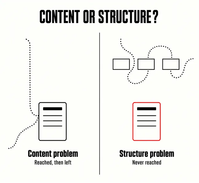
Structure is three decisions, and each one fails in its own way. Getting one of them right does not rescue the other two.
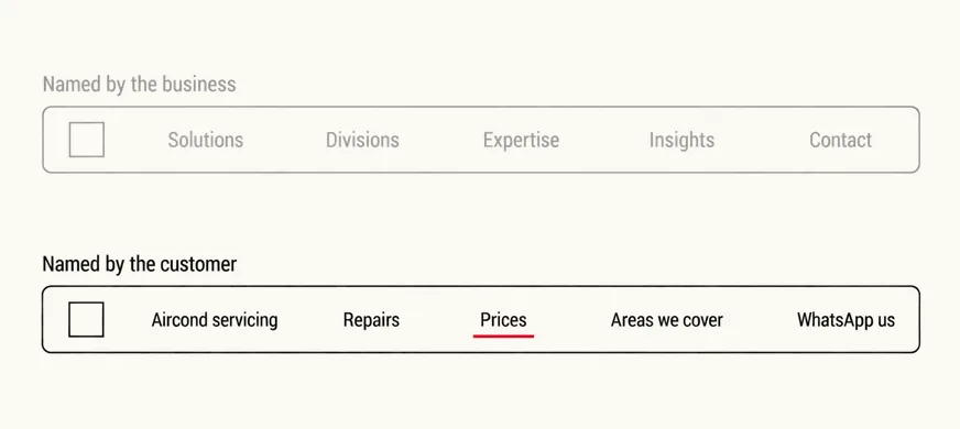
Pages should be grouped by what the visitor is trying to do, not by how the business is divided. An air-conditioning company that files its pages under Residential, Commercial and then each brand it services has grouped by department. Its customers arrive with “unit not cold”, “due for servicing” or “need a new one installed”, and none of those maps onto the menu. Google’s own starter guide makes the same case from the search side: it is worth organising a site in a logical way because it can help search engines and users understand how your pages relate to the rest of your site.
Nielsen Norman Group’s second usability heuristic is the rule for every label on the site: use words, phrases, and concepts familiar to the user, rather than internal jargon. “Solutions”, “Offerings” and “What We Do” tell a visitor nothing about what is behind them. “Aircond servicing” does. In a market where customers switch between English and Malay mid-sentence, the right word is the one they type into your WhatsApp, not the one in your company profile. If they write “aircond”, that is the label, however informal it looks to you.
The menu is only one route. The others are the links inside pages, and they are where most small sites are thinnest. Google is plain about the minimum: every page you care about should have a link from at least one other page on your site. A pricing page reachable only from the footer fails that in spirit even if it passes in theory. So does a services page with six buttons all reading “Learn more”, because good anchor text is descriptive, reasonably concise, and relevant to the page that it’s on and to the page it links to. A button that says where it goes gets clicked by the people who need that page and skipped by the ones who do not, which is the point.

There is a research method built for exactly this question, and a small business can run a rough version of it without software. Nielsen Norman Group defines a tree test as an evaluation of a hierarchical category structure, or tree, by having users find the locations in the tree where specific resources or features can be found. The tree is shown without any visual design or content — which is what makes it useful here. If people cannot find a page from its name and position alone, better writing on that page will not change the result.
Be honest about what five people tell you. It finds the worst problems quickly; it is not a statistic, and NN/g is clear that quantitative tree testing needs a larger sample. The same applies to card sorting, the companion method, where participants place individually labeled cards into groups according to criteria that make the most sense to them. NN/g recommends at least 15 participants even for the qualitative version, which few small businesses will recruit.
There is a free substitute that gets you part of the way. Read the last three months of WhatsApp and form enquiries and write down the words people use and the things they ask about together. It is not a card sort, and it only hears from people who got as far as contacting you. But it is your customers’ own vocabulary, in their own groupings, and it costs nothing but an evening.
Start with a reassurance from Google, because it changes the order of work. The same starter guide says: Don’t drop everything and start reorganizing your site right now though, because search engines will likely understand your pages as they are right now, regardless of how your site is organized. For a site of a few dozen pages, the case for restructuring is the visitors, not the rankings. That also means most of the fix never needs to touch a URL.
Then run the same tree test again, with the same tasks and five different people. If the task most people failed now mostly succeeds, the structure was the problem and you have fixed it without rewriting a page.
Somewhat. Google says a logical organisation helps search engines understand how your pages relate to each other, and internal links are one of the main ways it finds pages in the first place. But it also says search engines will likely understand your pages as they are, regardless of organisation. On a small site, the larger gain from fixing structure is visitors finding pages, not rankings.
There is no reliable number, and anyone quoting one is guessing about your customers. Short enough to read at a glance on a phone is a sensible limit. The better test is the tree test above: if people pick the right item first for the tasks that matter, the menu is the right length.
Usually not. Names, menu groupings and links inside pages can all change while every address stays the same. Change a URL only where it is actively misleading, and redirect the old address to the new one when you do.
Many of the sites owners describe to us as needing new content turn out to need a new map. The pages are good; the menu, the names and the links between them were set up years ago around a business that has since changed. Our website revamp service starts with the tree test described here, run on your own menu with your own enquiries, so any rewriting that follows goes into pages visitors can actually reach.