
- Resources
Innovative Thinking


A contact form is a small negotiation. The visitor hands over something — a name, a number, a description of a problem — before you have given them anything at all. Every field you add raises your side of the bargain, and every visitor decides, one field at a time, whether the conversation is still worth having.
Most website forms we audit ask for eight to twelve things before a human replies: company name, budget, address, how you heard about us, preferred contact time. Almost none of it is needed for the first reply. This article is about what the first conversation needs, what each extra field costs, and how to check your own form in an afternoon.
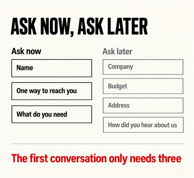
Three things: who is asking, one way to reach them, and what they need. Name, a phone number or email, and a free-text box. With those three you can reply to anyone. Everything else on a typical form is information that would be useful later, collected now, at the point where the visitor is least committed to you.
The test for any field is what you would do differently in your first reply if you had the answer. Budget? You would ask on the call anyway, with context. Company address? Irrelevant until a quote is written. “How did you hear about us?” is a question for your analytics, not your prospect — and why visitors come and nobody contacts you describes what the form looks like from the other side of that bargain.
If a field would not change your first reply, it does not belong on the first form.
The largest public measurement of form length is of checkout rather than contact forms, and that is worth being clear about. Baymard Institute’s running study of checkout flows puts the average 2024 checkout at 5.1 steps and 11.3 form fields, with 17% of users having abandoned a purchase because of checkout complexity. Those people had already decided to buy. A contact-form visitor has decided much less, which is the direction the figure points even if the number does not transfer. The checkout version of this problem is in where Malaysian online stores lose orders.
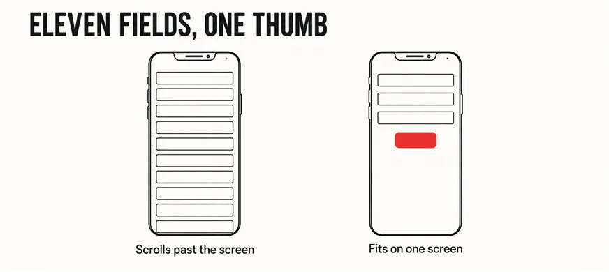
Because on a phone every field is a screen’s worth of effort. Eleven fields on a desktop is one glance; on a 6-inch screen it is three or four scrolls, a keyboard covering half the page, and a different keyboard for each field type. The form that looked reasonable in the design file is being completed one-thumbed in a queue, as a mobile-friendly site that is hard to use sets out.
Two technical habits recover most of the cost without removing a field, and both are documented by the people who build the browsers. The first is autocomplete. Chrome’s form best practices are blunt: add autocomplete values to form fields wherever possible, so the browser fills name, phone and email from what it already knows. MDN’s reference for the autocomplete attribute describes it as the way a page tells the browser what information a field expects and whether it may fill it in. A three-field form with correct autocomplete is often completed in two taps.
The second is the right keyboard: a field marked as a phone field opens the number pad, an email field a keyboard with the @ sign. Single attributes, no cost, and routinely missing from a page builder’s default form widget.
A requirement, and a surprisingly low bar. The accessibility standard’s success criterion 3.3.2, Labels or Instructions sits at Level A — the entry level — and says only that labels or instructions are provided when content requires user input. Its stated goal is plain: users know what information to enter.
The common failure is the placeholder-as-label: grey text inside the field that disappears the moment someone starts typing. On a three-field form a visitor can hold it in their head; on a ten-field form they cannot, and the half-filled form is abandoned when they forget what the fourth box was for. A visible label above the field fixes it for one line of layout, and matters for screen-reader users, for whom a placeholder is frequently not read at all.
The same instinct that over-asks tends to under-explain. A form that demands a budget range should say why; a form that asks for a phone number should say when you will call. The trust signals visitors read before contacting you are mostly this kind of small, specific reassurance — and the wording of the button itself is the last of them.
Move them, do not lose them. Everything a long form collected is still worth knowing — just not in the first thirty seconds. The clean pattern is two stages: the three-field form that opens the conversation, then a short second set of questions on the thank-you page or in your first reply. People answer freely once they are in a conversation and reluctantly before one.
The thank-you page does more than host the second stage. It is the point at which the enquiry becomes countable, which is the mechanism behind what happens after a form is submitted, and it is where you set the expectation of when a reply arrives. A form that ends in a flash of grey text saying “Thank you” has done neither.
Some businesses genuinely need more before replying — a clinic cannot triage without the service, a logistics firm cannot quote without a route. The three become five; each extra field must still earn its place in the reply. Regulated sectors should also check what they may ask and promise at all; the advertising rules for clinic websites is one example.
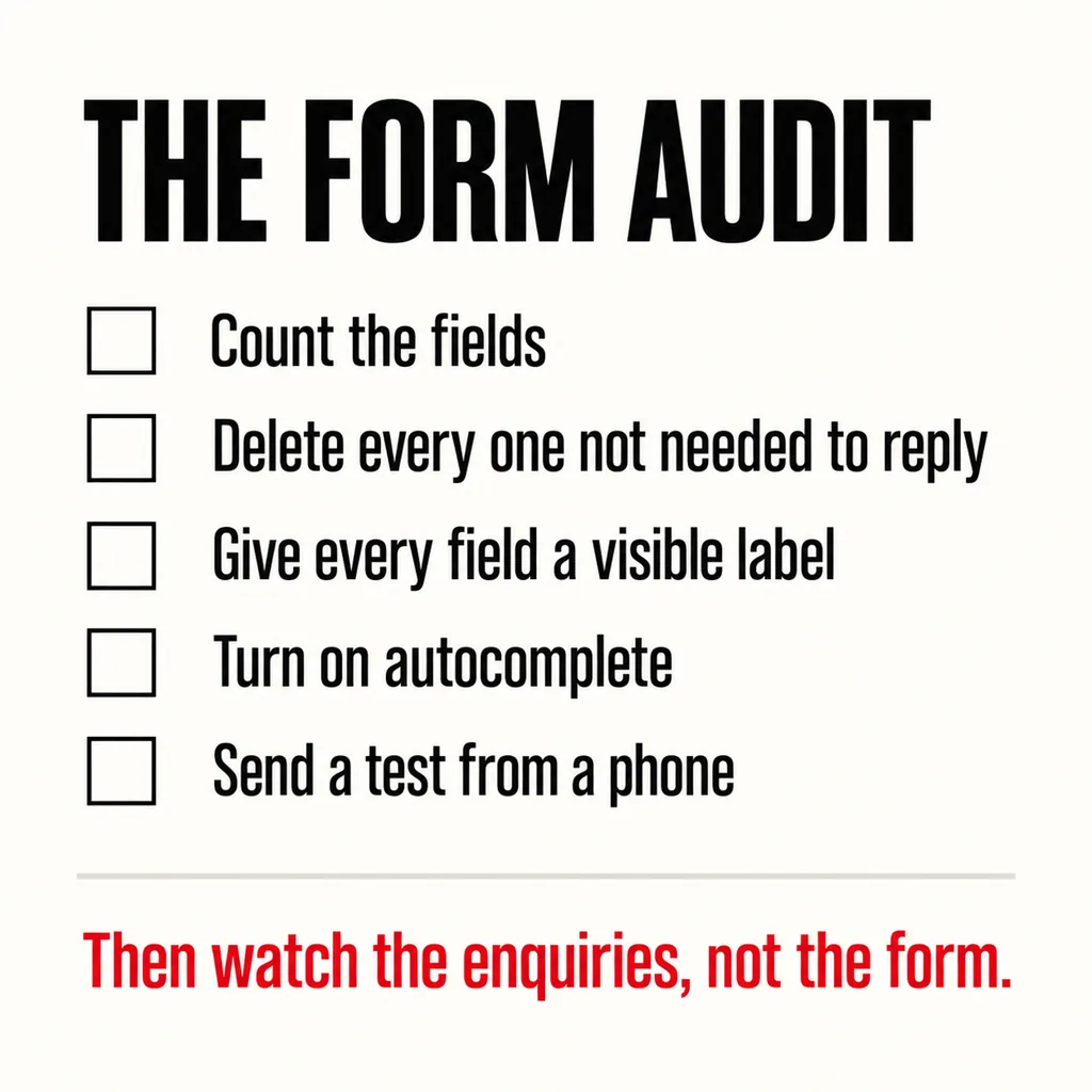
| Step | How | Pass |
|---|---|---|
| Count the fields | Open the form on your phone and count every box, including dropdowns | Three to five for a first enquiry |
| Justify each one | Ask what changes in your first reply if you know the answer | Nothing changes: remove it |
| Check the labels | Start typing in a field: does its name stay visible? | Yes, above the field |
| Check autocomplete | Tap the name field: does the browser offer to fill it? | Yes, and the phone field opens the number pad |
| Send a test | From a phone, on mobile data, to the live site | It arrives, and the thank-you page appears |
Then stop looking at the form and watch the enquiries, the only measure that matters. If the count rises after you shorten it, the fields were the problem. If not, the problem is upstream — the page itself, covered in running a landing page audit without guessing, the traffic reaching it, as in ads that do not convert, or the route in, as in the sales page nobody can find.
Some, and it is the right trade. A long form filters out the unserious and a share of the serious with them; a short form plus a two-minute call filters better and loses nobody worth having. Spam is solved by protection on the form, not by more questions for humans.
If you genuinely need more than five answers, a multi-step form showing one or two questions at a time beats a single long one: each screen is small and progress is visible. Still ask of every step whether the reply would change without it. Most multi-step forms we see could lose a step unnoticed.
For many service businesses, yes, and offering both is the usual answer. A WhatsApp link is the shortest possible form — one tap and a message — for people who would never fill in a box. Keep the form for visitors who prefer to write properly or enquire outside hours, and count both.
Shortening the form is one of the first changes we make on a site we take over: cheap, reversible and measurable within a month. Our web development and design service rebuilds the enquiry path as a whole — form, labels, thank-you page and the counting behind it — so that when the enquiries change, you can see that they did and why.