

- Resources
Innovative Thinking


Usually because they were prepared for a camera, not a phone. Most slow image problems are four faults: files uploaded several times larger than they are shown, one size sent to every screen, formats heavier than they need to be, and the main image at the top of the page told to wait its turn. Website image optimisation is fixing those four, and you can find every one of them from a browser in under an hour.
Whether your site is slow at all, and how Google times it, is covered in whether three seconds is still fast enough. This is the image half of that question.
Because the worst offenders usually live in the template. A logo exported as a large PNG, a full-width header banner, certification badges in the footer: each loads on every page, so one oversized file is paid for on every visit. Fix it once in the template and every page gets faster together.
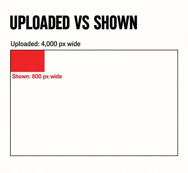
The commonest fault is simple oversizing. A photo straight off a phone is about 4,000 pixels wide; dropped into a content column 800 pixels wide, most of what the visitor downloads is thrown away. It is not rare: the HTTP Archive’s Web Almanac media chapter found that half of mobile pages sent a largest image bigger than a full-width picture on its test phone needed. Of those, it said: “they are almost certainly sending the mobile crawler more pixels than it can actually display”.
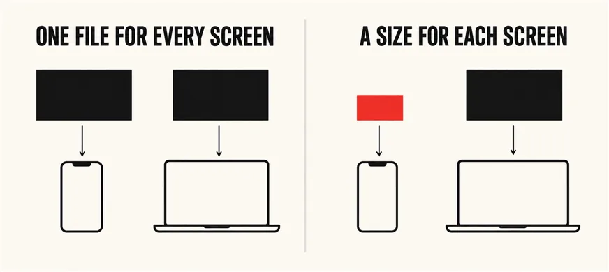
The second fault is sending one file to every screen. The fix has existed since 2014: the srcset attribute, which MDN’s reference for the image element describes as “One or more strings separated by commas, indicating possible image sources for the user agent to use.” A menu of sizes: the phone picks a small file, the desktop a large one. The same Almanac chapter found srcset on 42% of mobile pages. On the rest, a mid-range Android on 4G downloads exactly what the office iMac does.
One oversized file in the template is paid for on every page, by every visitor.
Yes. Each check needs only Chrome; run them on the home page and your busiest service page.
-scaled means the original upload was over 2,560 pixels and WordPress shrank it — the default threshold it introduced in version 5.3. It tells you camera originals are going straight into the media library.background-image, it has no sizes at all.loading="lazy". If the hero’s image tag carries it, you have found the most expensive word on the page.Which photographs deserve their place at all is the subject of our piece on website photography.

Lazy loading is good advice applied to the wrong picture. MDN defines it exactly: the browser “Defers loading the image until it reaches a calculated distance from the viewport, as defined by the browser.” For a gallery halfway down, that saves data. For the hero, the browser works out the layout first and only then asks for the image the visitor is waiting to see.
Google’s guidance on optimising Largest Contentful Paint is blunt: “Never lazy-load your LCP image, as that will always lead to unnecessary resource load delay, and will have a negative impact on LCP.” It also lists a hero set as a CSS background image among the cases the browser cannot find in the HTML, which is how many page-builder heroes are built.
It is still common. The Web Almanac’s 2025 performance chapter found that “about 16%-17% of pages lazy-load their LCP image, a figure that has held steady since 2024.” WordPress itself avoids it: since version 6.3 it marks the image it judges most likely to be the hero as high priority rather than lazy. The usual culprit is a speed plugin set to lazy-load everything. The fix is normally one setting: exclude the first image.
WebP for photographs, SVG for logos and icons where you have them, and PNG only for flat graphics that need a transparent background and have no SVG version. WordPress has accepted WebP uploads since version 5.8.
The same 2025 chapter found “JPG accounting for 57% of LCP images and PNG at 26%”, with AVIF — smaller still — at 0.7%. A photograph saved as PNG skips the lossy compression photographs are made for, which is why a PNG hero banner is so often the heaviest file on the page.
Format matters less than size, though. A correctly sized JPEG beats a WebP four times too wide. Convert after resizing, never instead of it.
Start with the image the page is timed on, then the template, then individual pages.
| Fault | Where it usually comes from | The fix |
|---|---|---|
| Hero lazy-loaded | A speed plugin or the theme | Exclude the hero from lazy loading |
| Hero set as a background | Page-builder section settings | Use an image block, or preload it |
| Oversized uploads | Camera originals, “Full size” chosen in the editor | Resize, re-upload, pick a smaller size |
| No srcset | Theme or builder outputs one file | Use image blocks that output sizes |
| Heavy format | PNG photos, old JPEGs | Convert to WebP after resizing |
Most take an afternoon. The checks then belong in routine website maintenance, a care plan and the pre-launch checklist, because the next banner upload will undo them.
The harder case is when the fault is the template: a five-slide full-width slider, heroes that can only be backgrounds, images injected by scripts. Compression cannot reach any of them. That is where what a page builder costs after the build becomes a speed question, and one of the signs a site is becoming expensive to keep. Even then the answer is usually a revamp of the templates, not a rebuild, as revamp or full rebuild sets out. The design trends worth their cost and a genuinely easy mobile site start from the same light page.
Partly. A good one compresses and converts to WebP. It cannot decide which image is the hero, turn a background into a real image, or stop a theme sending one size to every screen, and some lazy-load every image by default. Install one, then run the checks again.
It improves Largest Contentful Paint, the loading measurement Google uses, because the timed element is so often an image. Speed is one input among many; a faster page will not outrank a more useful one. The bigger gain is visitors on mobile data who stop leaving before the page appears.
No single number suits every image. Size it to the widest it is shown, allow double for sharp screens, then compress. The Improve image delivery insight compares each file with an efficient size for its format, which is a better test than any rule of thumb.
Image checks are the first hour of most speed work we are asked to do, and template faults behind them are a common reason a site gets revamped rather than patched again. Our web development and design service reworks templates so the right image loads first and every screen gets a size made for it, usually without touching content that already works.