
- Resources
Innovative Thinking


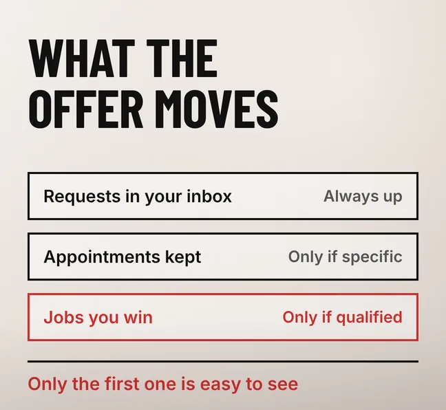
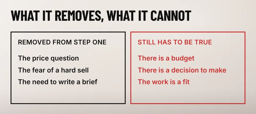
More requests, yes. More work, not on its own. A free consultation offer takes price out of the first conversation, so more visitors are willing to start one — and what rises is the number of people in your inbox, not the number who sign anything.
The offer has two jobs and most pages design for one. It has to make the right person raise a hand, and it has to tell the wrong person this is not for them. Written as two words on a button it does the first and nothing else, which is how a quiet contact page becomes a busy one that still produces the same number of quotations.
Usually yes, because it lowers what the visitor risks. Asking for a price feels like starting a negotiation; asking for a free call feels like asking a question, and far more people will do the second. What rises is the number of requests. Whether any of them reaches a quotation is a separate question.
That distinction matters because only the first number is visible. Form submissions and WhatsApp messages arrive with a notification; a quotation that never gets issued makes no sound. An owner looking at a busier inbox has every reason to think the change worked, and keeps thinking so until the quarter closes.
What the offer really does is widen the opening. Everyone who would have contacted you anyway still does, plus a group who would not have paid to find out whether you could help. Some of them are the customers you wanted; the rest are the ones who quietly cost you an afternoon each.
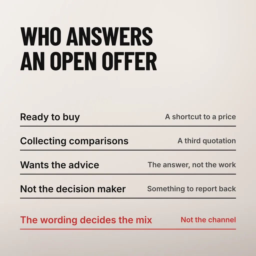
When the offer says nothing about who it is for. Two unqualified words read as free advice, so the request list fills with people assembling comparison quotes, people who want the answer rather than the work, and people with no authority to spend anything. The wording decides that mix, not the channel it arrives through.
None of those people are behaving badly; they are answering exactly what was written. A plumbing contractor whose contact page says “free consultation” has promised nothing in particular, so a homeowner wondering whether a leak is serious, a surveyor collecting a third quotation and a property manager with a real job to award all read it as an invitation and all send the same message.
Pulling the offer is the wrong correction: it loses the last group along with the first three, and the first three were never going to buy whatever the page said. Make the offer specific enough that three of those four groups recognise it is not addressed to them.
Ask one question with fixed answers instead of five open ones. A form of three or four fields plus a single multiple-choice qualifier — the kind of work, the budget band, when it has to happen — sorts the list before anyone picks up the phone, and costs the visitor one tap rather than a paragraph of typing.
Keep the rest short, because length has a price. Nielsen Norman Group’s form usability recommendations put it flatly: “Every time you cut a field or question from a form, you increase its conversion rate.” Describing their own form, they write that they “recently applied this technique to one of our own forms and reduced it from 6 fields down to only 2 fields”, and that “the reduced user effort and increased completion rates make it worthwhile”.
A fixed-answer question is cheap in the way an open text box is not, and Google treats it as the standard mechanism for lead quality. Its documentation on qualifying responses in lead forms says they “help you to identify qualified leads and improve your overall lead quality”, and that “when a potential customer submits the form with a qualifying answer, the submission is automatically tagged as a qualified lead”. One limit matters if you plan around the feature: Google states that “qualifying responses are available for Search campaigns only”.
On your own site a radio button does the same job. Pick the one question whose answer would change whether you take the call, and ask only that. For most service businesses it is timing or scope rather than budget: a band of ringgit figures invites people to pick the lowest one, and asking when the work has to start does not.
Name four things: how long it takes, how it happens, what the person leaves with, and who it is not for. A visitor who reads only “free consultation” fills those blanks with a guess, usually a sales call they will have to escape. A promise with edges attracts fewer requests and better ones.
| What to state | Vague version | Specific version |
|---|---|---|
| How long | Free consultation | A 20-minute call |
| How it happens | Get in touch | On WhatsApp, at a time you pick |
| What they leave with | Discuss your needs | A rough scope and a price range |
| Who it suits | For businesses | For sites already live and earning |
The last row does the sorting, and it is the row most pages leave out. Saying who the offer suits is also saying who it does not, which feels like turning away business and is the only part of the wording that protects your calendar.
The button matters less than its surroundings, but the words on it should describe what happens next rather than the fact that it costs nothing. Where the button belongs and how to word it is covered in what a website call to action should say.
Count four numbers over a full quarter: requests received, appointments kept, quotations issued and jobs won. The offer is working when the last two move. A rise in the first with no movement in the last two means the page is generating unpaid consulting, which is a cost rather than a marketing result.
| What to count | Where it comes from | What it tells you |
|---|---|---|
| Requests received | Form entries and WhatsApp messages | Whether the offer is visible at all |
| Appointments kept | Your own calendar, no-shows removed | Whether the people asking are serious |
| Quotations issued | Your quotation numbering | Whether the calls reach a real scope |
| Jobs won | Accepted quotations | Whether any of it was worth the hours |
The gap between the first two rows is usually the first thing to fix, and rarely the offer’s fault. A request that waits two days for a reply has gone elsewhere, and the minutes after a submission — the confirmation, the notification, the reply — decide more of that gap than the wording does. Those are set out in what happens after a form submission.
Give it a quarter before judging. One month tells you how many people clicked, which is the number you already knew would rise.
Usually not, when the work itself is what you sell and the call is how you scope it. Charge when the consultation is the product — an audit, a diagnosis, a written recommendation someone could act on without hiring you. A fee credited against the first invoice is the middle option: it filters out people collecting free advice while costing a real buyer nothing.
They answer different visitors, so most service sites need both. A quote request suits someone who already knows what they want built and needs a number. A free consultation suits someone who cannot yet describe the job, which is the commoner position for an owner whose website has drifted out of date. Offering only the first loses that second group.
Twenty to thirty minutes is enough to scope most small-business work, and short enough to hold without being rude. State the length in the offer. A call with no stated end runs until someone gets uncomfortable, which punishes you for the requests that were never going to convert.
A free consultation offer is the piece of the enquiry path that fails quietly when the rest of the path is not built for it. Our digital marketing and ads service works on the whole path: what the page promises, what the form asks and what the campaign sends to it. One thing to do this week: open your contact page and check whether it says how long the call takes and who it is for. If it says neither, that is the edit.